after creating my outline i made it a live paint group and then filled in the basic block colours which was probably the easiest stage of the entire design process.
it actually looks good considering its only a base but its in desperate need of texture and shading which i plan to place on another layer. im hopefully going to try and retain the balance between block colours and texture - too much texture would be over whelming too many block colours and the poster will look flat. im pleased so far and everything seems to be going well.-
Tuesday, 30 October 2012
Drawing in Illustrator
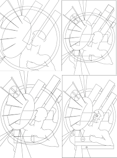
these are some printscreens of the drawing process which i began by mapping out all the block shapes ( starting with the ones that were already in the tool box circles rectangles etc) before i began using the pen tool to intergrate the curved lines of the man. the man was by far the most complicated part of my design so i left him till last which gave me time to fully establish my background. the white arrow tool was a lifesaver when drawing the curves since it allowed me to adjust the anchor points which helped to generate some clean lines. so far it looks good but i havent started on the hard part: colouring in!
Final Design idea
This is my final design the scan on the left clarifies the basic shapes of my poster whilst the one on the right introduces the colour scheme. i intend to live trace my scan in order to create the base for my poster which is why i havent included colour. im really happy with the design so far in terms of shape and im excited and nervous about translating the colours and textures into illustrator since theyre integral to the design.
The Slogan
Although i was fairly sure that i
wanted to design a poster revolving around the block aspect on Facebook it was
really cemented when i started creating slogans. i tested out a few others
using different aspects from other sites for example i had - "youtube,
most viewed share and share alike!" which would promote the 'share'
icon on youtube which i liked rhythmically but i didn't think that it really
related to propaganda slogans. since i liked the rhythm of my slogan above i
decided to try and come up with a slogan which advertised the block icon using
a similar rhythm but had more of a contextual reference. in my research i came
across the artist Steve Thomas whose office propaganda posters featured a
slogan taken from an American propaganda poster.
so i decided to play around with his slogan and came up initially with the slogan:
"Loose lips, create rifts so block people you don't like!"
I was fairly happy with this slogan until i realised that the "block people you don't like!" was a little judgmental and seemed to be encouraging people to block anyone which wasn't really my aim. my aim was to advertise the block symbol in terms of protection ( if your'e being hassled or are a victim of bullying then you block them ) so because of this i had to change the last phrase whilst still retaining the correct rhythm . i then came up with what i think will be my final slogan:
"Loose lips, create rifts so block people who aren't nice!"
i was much happier with this slogan, it conveys my overall message and seems to be a lot lighter than some of the previous slogans researched (probably because it lacks a direct imperative) its subtle but its understandable which is the most important thing.
The Pitch
The pitch went well - it was interesting trying to explain my development to
others it helped to clarify my design ideas and helped to ensure that i hadn't
strayed too far from the brief.


The response to my final design was very positive, the only thing to
consider was my font choices and whether i stick with a basic hand drawn bubble
font rather than a similar font taken from my spanish propaganda poster. i plan
to try out both before deciding but i think that my peers were correct and a
more spanish curled styled font would detract from my overall design.
The design above is what I've come up with so far i'm really pleased i think
i've successfully managed to combine the spanish propaganda poster style with
Facebook's modern aspect and the modern work of propaganda artist Steve Thomas.
i've included the angularity of the spanish character and kept the block
colours and placed emphasis on shape but i've also included the block symbol
shield ( inspired by Steve Thomas' virus poster) and altered the colour scheme
to ensure Facebook's representation.


Tuesday, 9 October 2012
general intresting spanish propaganda posters artists unknown
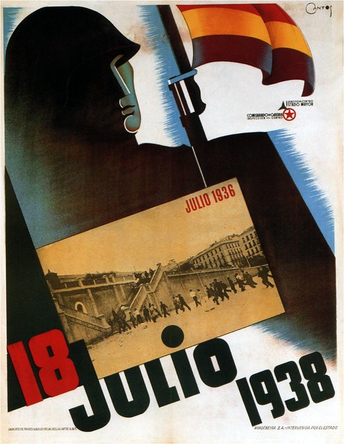
18th July 1938
i love the angularity evident within this poster its simplicity makes it a lot more effective and more visually striking theres also a lovely gradient which drags the eye diagonally across the frame. and the soft brush strokes break up the white background whilst also highlighting the diagonal positioning.
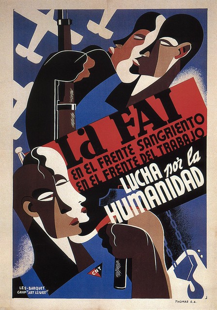
anarchist federation 1937
it is the people that i like the most in this poster there faces are defined by the abstract shape and i love this flat style which elucidates the fluidity of the curves on the face. the colours work well together the browns contrast with the background outlining the silhouettes. although the faces are curves there is an angularity which is congruent with a lot of the other spanish posters already researched.
http://www.dieselpunks.org/profiles/blog/show?id=3366493%3ABlogPost%3A187587&commentId=3366493%3AComment%3A187499 ( all posters above)
Carles Fontsere
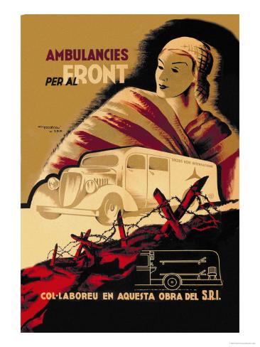
this design is less simple than the one below although there is an emphasis on shape this poster is a lot busier than the one below whilst, the other is dominated by one single element: the tank, this poster seems to be segmented into three -the woman at the back, the ambulance and then the foreground trenches. this segmentation directs the eye up the frame to the female figure and the heading which obviously establishes the overall message " ambulances to the front". there is a hand drawn feel to the top of the poster which softens the shadow (an almost halo around the head) and provokes contrast with the bold oblong ambulance and the vibrant red outlined trench. i don't really like the mustard sienna colour in the background just because its very dark and i prefer the brighter reds but it does create a plain bland background which doesn't interfere with the rest of the poster.
http://www.allposters.com/-sp/Ambulancies-Per-Al-Front-Posters_i2915937_.htm
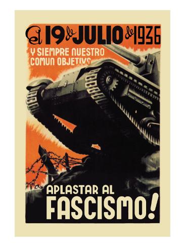
i think that this is one of the more effective Fontsere posters mostly because i really like the colour scheme- black white and orange which keeps both the design and the message incredibly simple. the bottom slogan "crush fascism" places this poster within the communist movement and i love how Fontsere has represented this "crush" visually through the tank. the monochrome tank itself is the main focal point its realism contrasting against the block orange background. the soft white edging softens the solid orange as it approaches the tank which effectively outlines the tank elucidating its shape. Other than the colour palette used i'm not really sure if i could use any of the aspect in my design ( my own concept revolves around blocking what people say) but i guess i could use the tank as a representation of the block symbol.
http://www.allposters.com/-sp/Our-Common-Objective-Always-to-Squash-Fascism-
Posters_i7862333_.htm
Subscribe to:
Posts (Atom)


