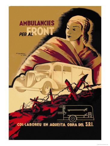
this design is less simple than the one below although there is an emphasis on shape this poster is a lot busier than the one below whilst, the other is dominated by one single element: the tank, this poster seems to be segmented into three -the woman at the back, the ambulance and then the foreground trenches. this segmentation directs the eye up the frame to the female figure and the heading which obviously establishes the overall message " ambulances to the front". there is a hand drawn feel to the top of the poster which softens the shadow (an almost halo around the head) and provokes contrast with the bold oblong ambulance and the vibrant red outlined trench. i don't really like the mustard sienna colour in the background just because its very dark and i prefer the brighter reds but it does create a plain bland background which doesn't interfere with the rest of the poster.
http://www.allposters.com/-sp/Ambulancies-Per-Al-Front-Posters_i2915937_.htm

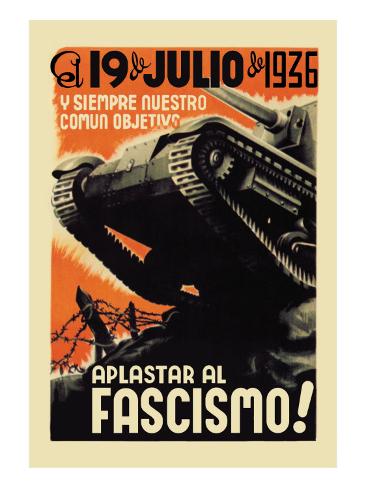
i think that this is one of the more effective Fontsere posters mostly because i really like the colour scheme- black white and orange which keeps both the design and the message incredibly simple. the bottom slogan "crush fascism" places this poster within the communist movement and i love how Fontsere has represented this "crush" visually through the tank. the monochrome tank itself is the main focal point its realism contrasting against the block orange background. the soft white edging softens the solid orange as it approaches the tank which effectively outlines the tank elucidating its shape. Other than the colour palette used i'm not really sure if i could use any of the aspect in my design ( my own concept revolves around blocking what people say) but i guess i could use the tank as a representation of the block symbol.
http://www.allposters.com/-sp/Our-Common-Objective-Always-to-Squash-Fascism-
Posters_i7862333_.htm
No comments:
Post a Comment