Friday 24 May 2013

Evaluation

Overall im really happy with how my website turned out since coding was very new to me, George helped me a great deal with the responsive aspect and i like how it moves, it helps to separate my main text and the images scale well- the navigation in particular works well on mobile because the images make it clear which page each button links too. I love how well my patterns and headings integrate into the design and i did enjoy the css styling, but i really didn't like making any of the technical issues or the html code, i found making the website far harder than any of the other projects and i struggled a lot with the responsiveness. im glad that i made a lot of my aspects beforehand in Illustrator though because it made designing the site and placing them  a bit easier, which helped me to see design before i made it. In future id love to understand web design a little more though if i had the option i'd probably avoid creating a website- i preferred the video, book cover projects i understood how they worked and they relied on my artistic skill something the website did not although i have managed to include a bit of it within my site. i think my favourite part of the website design was making my patterns so in future projects i'd love to continue that aspect.
 Full screen
 Ipad landscape
 Ipad portrait
Mobile


The Ibook contained a lot of my patterns and although the content between the two was very similar i did add in a few extra items which i used to make interactive. The styling between the two isn't completely the same because i made separate backgrounds for the Ibook but i think they both relate well to one another and certainly reference one another.i really loved creating the ibook and im glad that i created it before i made my website because it helped me to see how all of my elements worked together. I wanted to make my Ibook fun and visual as well as interactive and explorational which also helped to form the basis for my website.  

Ibook


If i had more time i would have liked to explore a little bit more with my website, possibly trying to incorporate a little java script (which i dont really understand how to use which is why i didnt put any in my site now.) however i think my website is as finished as its ever going to be i've reached my limit of code understanding.  Despite my dislike of web design Im proud of my visual style in both my site and my book i think that its one of my strengths and i'm glad i could introduce it into both projects.


Tuesday 21 May 2013

User Testing


After i made the changes highlighted in the crit i i then put it through some user testing to check the basic function of the site. Posing various questions about my sites navigation and content to ascertain its usability and overall feel.


User Testing
Begin on the homepage

Questions 

How legible do you think the text is, is it easy to read on all sizes of the site?

Gina- the text on this website is readable and spacious, the transparent background helps make the text stand out. 

Jake- The text on the site overall utilises space, and is easily legible. The only change i would personally make is that on the “Dragonfly” section, some of the text cam get lost when on top of the green background. Consider revising Jessica.


Can you find the sentence beginning “The Green Darner however can shiver its wings,”- is it easy to find? how navigational is the site?


 Gina-i found the sentence from the home page by clicking on the green darner button. The navigation is easy to use as the buttons are labeled out as well as being pictures. 

Jake - I found it using the iMac’s “find” function. Although, this did not hinder my ability to navigate to the correct page before hand. The navigation is slick and well thought out with a new play to a very static navigational structure.

 Can you find the Monarch Butterfly Fun Facts at mobile size?

Gina- finding the fun facts was simple as i was on the green darner page i scrolled to the top to find the Monarch butterfly button, adjusted the page to mobile size and found the fun facts at the bottom of the page. 

Jake Is The King -  Found them! It was very easy to navigate the mobile site as it is a continuous stream of data. The heading is very legible and easy to find.

How many species of hummingbird are there? how easy is it to find the answer to this question?

Ginaover 300 hummingbird species. very easy to find simply clicked north on the header which took me to the top hummingbird button. 

Jake  - There is over 300, It’s very easy to find, right at the top. A very striking fact.

Beginning on the Green Darner dragonfly page how easy is it to find and navigate back to the home page? is the home page obvious enough?

Gina-it is very simple to get back to the homepage, by clicking the title heading which tilts this makes it more obvious that its navigation. 

Jake - As obvious as it ends up being, i did not notice that there was a home button at all. After being told to look for it i found it, but before that i had no idea there was one there. Sorry Jess.

Are there any problems with the site that you found? Please explain below.

Gina-There are no major problems with the website it is all simple to navigate around and is very well designed. I think the fact most the navigation moves on a click helps differentiate interactive elements. I would just say to look at the text as spaces are needed between words. 

Jake - Overall i have no gripes with the site, the only problem i have encountered is how noticeable the home button is. The fact that i didn’t see it saying “home” anywhere, may be an issue.

Overall opinion of the site
Gina- Its well designed and fun there are also various interactive elements that make it more interesting, its visually very striking and although it has a very basic layout it is effective and relies more on the style which is fine because it looks good. 


Jake- The site is fine, slight home navigation issue with the home button but it works, also an unconventional nav with interesting moving button images.

One of my users seemed to have a problem with the light green background colour on my dragonfly page but this issue was not raised with my other tester- Since a darker background would certainly drown out the text i plan on keeping this the same since i think its more of personal preference, as well as this it was pointed out that my home page navigation wasnt as obvious but again this was contradicted by another user, i do think that the home is a little obscure but ive tried to make it more obvious by applying the same tilt that are on my  nav elements and throughout my research many of the logos and headings on certain sites use this same form of navigation so I'm also going to rely on general knowledge of the web and assume that my users will recognise the heading as a navigational element. Design wise i felt that three buttons in a row looked better than four which is why i opted to put the home nav on my heading. 

Validation Test


We had to see if our website could be validated by wsc3 site, when i put my dragonfly page in it had 3 errors which were spaces between some of my ending tags and an irrelevant line of code. After these changes were made my green darner page was apparently valid for the web since it popped up with the banner above (although i have made some changes in my code since i validated though they should have no impact on this). My css also had 3 errors which were tiny - wrong id spacing, wrong quote mark and an unpaired bracket which i repaired and then it passed the online validator.

The Crit

I got really good feedback for my Ibook, they liked how explorational  it seemed and seemed to be happy with the crowded full and fun theme. They liked all the small details that i included but felt that i should definitely leave it so that i didn't risk the book with overcrowding. visually it was strong and they had no criticism since each section had a clear theme throughout that made sure each section/heading was clear. My website also received graphical approval and they felt that it all scaled well when at mobile size, they did however feel that my text line spacing should be larger since it was too condensed at any size making it harder to read, i completely agree and have set out to change this so my line spacing is now at 1.6em's and my subheadings (What is migration and Fun Facts) are now slightly larger in size and bold so they stand out more. With these changes im now much happier with my website and im certainly sold on my visual style.

Friday 17 May 2013

Website Print screens so far.....

So far im very pleased with the way my website looks, and George has helped to make my website responsive (from what you see below to two columns of text for the large column on the left and then one whilst my images simply scale down). ive managed to put in my tilt on my navigation so far which gives my site a playful feel and i like the aesthetics.


At the moment video needs to be placed on the right hand side, and a small image gallery at the bottom of the monarch and dragonfly pages.
ideally id prefer to have one or two large images on my hummingbird page on the left since i dont have a video but again my images need to be resized.
a small image on the right hand side is needed to fill up the space on my home page and then that is essentially done. i would also like to make my top keep calm and migrate south and my bottom keep calm and migrate north images have some kind of link or reference so they jump to the top or bottom (this isnt necessary on the home page, but on my pages with more content its a feature that could come in useful for the mobile since areas of my text are particularly long when at mobile size.

Css tricks to apply to my Website

i wasnt really sure how to add some movement into my website so i began by researching some simple css tricks that i could use within my nav or images. i didnt want to make anything too overwhelming but i thought some little tricks may liven my site up a bit,


http://designshack.net/?p=36895

i really liked the the look of this tilt option which i would specifically use on my nav buttons, it only uses css so i wouldnt have to mess with my html and i think that its a very fun hover that would mirror my websites overall style.


this one generates a nice transition between one image to the next, it may work better than an image gallery since it will add a sense of  movement and my images could then be scaled using the same class and my other elements (possibly my heading). Before i can even attempt this though all of my images need to be the correct size so they'll fit neatly onto the page.


Production Schedule


Production Schedule

Pre Pitch- general research, specified research, pattern designers, make headings/patterns gather images and resources, create wireframes

Pitch- 11th March

Week of the 18th March-
  • Finish organizing resources
  • Make any suggested changes brought up in the Pitch
  • ensure that blog is fully up to date
  • (Sues work also)

Week of the 25th March

  • Start investigating Ibooks
  • Look at some interactive examples of the Ibook and continue blog
  • Begin building backgrounds for Ibook

Easter Holidays 1st April to 15th-

  • Work on Ibook
  • Get all of my content into the Ibook- doesn’t have to be interactive at this point but want a basis to work from so that interactivity can be added at a later point
  • Gather sources for Sue
  • Continue blog
  • Generate some cleaner wireframes with labels

Week Beginning 15th April-

  • Finish Ibook and corresponding blog
  • Make sure Ibook is interactive
  • Tidy sketchbook

Week Beginning 22nd April to end of the week beginning the 29th April-

  • Work on Website
  • Continue basic website
  • Write Sues essay


Week beginning 6th of May end of the week beginning 13th May-

  • Ensure website is responsive (ask George)
  • Put Videos and images into Website 
  • Experiment with css tricks
  • Blog

Week beginning 20th May-
  • Crit
  • Finishing touches
  • Evaluation
  • Hand in Final essay for Sue

Footer ideas and new pattern

i wasnt really sure if i was going to use a footer but after thinking about my website and its visual style i felt that a fun phrase could be well integrated into my site, i used some of my home made typography and the american type font with an additional brush stroke to generate the phrase keep calm migrate north a phrase that ive taken from my last projects british poster research. each colour corroborates to each page and would be a practical directional aid to ensure people scroll up to the top, since my content isnt very long i didnt think i needed to put my nav on a parallax but i felt that some kind of scroll up aid was needed.


overall really happy with how they look and i plan to have them scale so that they are responsive.


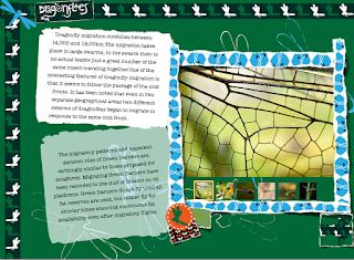
i thought that my dragonfly pattern was too dark for a main background so after looking at some of Julia Rothmans work i decided to create a new one specifically for the background. the mint green colour was a homage to Orla Kiely's vintage website but it still worked with my turquoise/darkgreen heading and footer.

Pattern website- Inspiration


http://www.orlakiely.com/uk/

i wanted to see how patterns were used as backgrounds in websites so i looked up the oral kiely website- i knew she designed patterns so i thought that there would be a fair chance that her web page would use patterns. i liked hoe a large background translucent square frames the content and helps to separate the images from the background. although the pattern has been used its not as bold as i think it could have been, the translucent square wrapper softens the backdrop of the content so i don't think it needs to be so pale, something i will consider in my own site. i liked how the pattern was a bit visible in the images which incorporates a sense of layering.


http://www.juliarothman.com/wallpaper/#6

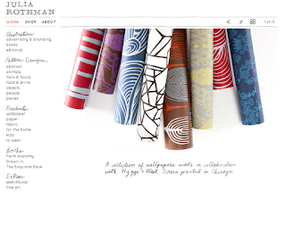
i also found this really cool wallpaper design site, i wanted to again look at how patterns have been portrayed and although they haven't been used in the actual website like i'd hoped, the patterns themselves are very fun and inspirational, and ive come to the conclusion that i need to change my dragonfly pattern since its too dark.  i briefly considered adding some kind of texture to my patterns but i thought that it was too overwhelming.

Wednesday 15 May 2013

Ibook Table of Contents


So i combined strips of my patterns to generate an effective cover, i wanted it to mirror my pages but i also wanted it too look like a book cover which is why i added a stitched border and corners to the overall design. placing my heading on a large black strip was to draw the eye straight to the logo and to break up some of the patterns so its not too manic although admittedly there is a lot going on within the cover.

 i had a few issues creating my table of contents because each page used the same constraints on the text which is why some of the headings arent as alined as i'd like them to be. In the image above i added the butterflies to make it relate more to my subjects, although the butterflies are all the same i dont think it matters too much because they are so small. The blue frame around the edge related to my framed facts at the beginning of each chapter.
 i opted to use photographs to give my ibook a bit of relief from all my patterns, as well as this i guessed that the table of contents would display my chapters which use the patterns as backgrounds.


Making Ibooks Continued

My overall page designs for each section, each chapter is the corresponding pattern and heading with a framed area of facts.
my first section basically defines what migration is and various migrating species and is accompanied by a quiz about general migrations.

i placed a lot of patterned strips behind my quiz simply because the background is black and i felt that is needed splashes of colour to break up the expanse of colour. at first i was worried that it looked a little manic but i think that because of the black background and there isn't any thick areas of pattern save for the boarders that it works visually.


ive tried to manipulate various angles to keep the content more visually striking and maintain a clear balance between text and images, my pages are crowded but i didnt want them to be too crammed, there had to be breathing room which is why ive kept the pattern shapes small and carefully arranged my items so they overlap in the right order.


the arrows that ive placed on the edges of each page swipe to the next page (i books did this automatically anywhere along the edge but i thought the arrows added a bit more personality to the simple swipe action).


 altering the opacity of the various text boxes also helps to contrast in colour, its softer than my patterns and it allows my background to come through which initiates a sense of depth. My aim was to create a patchwork effect which i felt was key to my visual style.

 out of all of my pages, my hummingbird one is the one that i like the least, its not as interactive as the others, but i ran out ideas, some of the images have pop overs and there is an audio file but it seems a little flat compared to my others. i dont really know how to change this however so i plan on bringing it up in the crit.

overall im fairly pleased with how my pages and chapters have turned out there is a clear style and im really happy with how well my patterns have integrated, in the pitch my plan was to use my patterns and thats pretty much the only design plan i had so im glad I've managed to build on that and make it work with my content.