
Thursday, 27 December 2012
The Poster so far.....
Making the Poster in Photoshop 2
after i added in my book cover i wanted to add a small design that would concur with my cover but would differ and provoke a bit of interest since the purpose of the poster is displaying the redesigned cover and advertising the book. since chess pieces was a major concept i opted to continue this theme and decided that i would incoporate a broken knight ( to represent the main character detective Phillip Marlowe).
i had a few scribbles in my sketchbook that i used for inspiration, i drew out the basic shape in illustrator since i preferred the drawing tools to the ones in illustrator. after i had my shape i saved as an adobe pdf and reopened in photoshop. dragging the design into a central position on a new layer.


i had a few scribbles in my sketchbook that i used for inspiration, i drew out the basic shape in illustrator since i preferred the drawing tools to the ones in illustrator. after i had my shape i saved as an adobe pdf and reopened in photoshop. dragging the design into a central position on a new layer.

i used the poster edges filter on the knight to define my lines and to blend my shading i also found that this filter incorporated a cartoony style which conicided with my cover. i briefly experimented with the ink filter but the red was lost a key element which i thought was needed to match the red of the book cover.

on the left hand knight abover i've added this fractured glass texture ( something i experimented a lot within my sketchbook) again the picture was found from shutterstock on the internet. i placed this texture across the bottom half of my poster atop my knight and the bloodstain erasing round the areas in between, before experimenting with the blending mode. vivid light was my favourite since it brightened up the knight and made the blood look incredibly vivid.
after this was done i added a few extra lines of text ( my name, Raymond Chandler and a quote which i thought directly related to my design) and i did this in much the same way as the previous text.
Making the Poster in Photoshop 1
since i designed my book cover in Illustrator and the brief specifically asked for photoshop software to be used i decided to create my poster in photoshop which would allow me to use a varitey of filters and textures.
since my cover had to be on the poster i saved by poster as both a working illustrator files and an adobe pdf in order to open it within photoshop.
 i found this simple upright shutter stock book image on the internet and thought it would make a perfect base for my book cover. since both the back and front of my book cover convey the big sleep storyline best together ive decided to place both the back and front on the poster. i knew that a black bacground would generate more of a contrast so i filled the background layer before introducing my two covers.

since the penguin template seperated by design clearly into back front and spine it was easy to copy each half of the cover and place them atop my base book. in order to align the angles correctly i went to edit-transfort and then distort which enabled me to stretch both covers across the book base.
after this was completed i incorporated the simple heading which i made to match my blurb. a simple fill rectangle as a frame and an OCR typewriter font.
since my cover had to be on the poster i saved by poster as both a working illustrator files and an adobe pdf in order to open it within photoshop.


since the penguin template seperated by design clearly into back front and spine it was easy to copy each half of the cover and place them atop my base book. in order to align the angles correctly i went to edit-transfort and then distort which enabled me to stretch both covers across the book base.
after this was completed i incorporated the simple heading which i made to match my blurb. a simple fill rectangle as a frame and an OCR typewriter font.
book cover so far ...

im really really pleased i think it looks really good and accurate to my hand- drawn design on paper, everything seems to work together well which is nice and im glad that i shaded by figures with a textural brush which really suggests contrast without being too obvious. i may get rid of the smoke coming from the gun since it looks a little cramped and im not sure on the positioning of the Ian Rankin at the top but i didnt know where else to put it since i wanted to balance the frame i plan on bringing up these small details in the crit to see what my peers think of them. i only just managed to fit all the writing on the back of my cover so it could be a little small but theres no way or rectifying that without altering the knight which i think it too complicated ( since i've got him and the knight just right) but i dont think it matters too much since the text is only one size smaller than i origionally planned.
The Blurb

Making the book cover- the text

I couldnt find any premade fonts that looked how i wanted my title to look so i opted to make my own, drawing it out using the pen tool. i wanted it to match the rest of my design but i also wanted to intergrate a playful element so i decided to generate something with a jagged angular cut out look which obviously concurred with the silhouette chess pieces.im not really sure if its of the deco period but it matches and works well in my design so im happy.


Friday, 21 December 2012
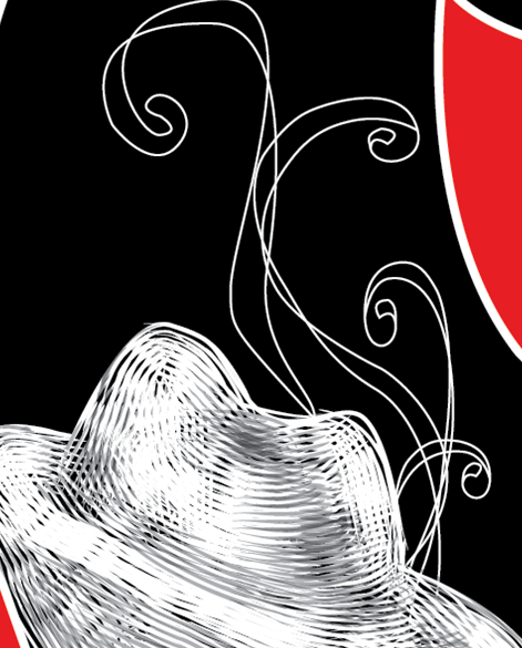
Making the cover 3- gambling smoke and bullets

adding the basic swirl shapes of the smoke helped to fill some of the excess space on the chest piece simultaneously intergrating a delicacy that contrasted against the blocky fill shapes. they're very simple and im not sure if they should be filled or not i plan on deciding after i've made the rest of the cover.


Making the cover 2- Shading

since i had the basic outline drawn i began by intergrating a sense of realism and depth by shading my characters- i knew they were going to be blank silhouettes but i didnt want them to be solid fill i wanted them to contrast against the chess pieces in more than just colour. in order to do this i opted to shade in my characters by using the scroll brush tool something i had practised using in the previous project. the scroll brushes were a collection of lines which when layered almost generates a cross hatch effect and were perfect for intergrating texture. since i thought they still looked a little flat with just the white brush strokes i also incorporated some grey lines which i used to form shadow. on the detective i mostly emphasised the lines of his coat and hat in order to segment the face from the body. in the femme fatale character i knew she was going to be naked ( since shes based off of the character Carmen Sternwood who appears unclothed twice in the novel) so i wanted to make this apparent without being too obvious so i applied the shadow along the contours of her body.

starting the book cover in Illustrator

I began by using the template downloaded from the Penguin Book Award website i emphasised the bleeds using the line tool to make sure that i worked within the correct space and filled the background with my chosen shade of red keeping the necessary logos and the barcode visible.

once i had a base to work from i started creating my design by drawing out the simple silhouettes using the pen tool. since the silhouettes were relatively simple it was a fairly easy process to generate the correct shapes.i added a thick white stroke in order to make a bold outline that would seperate the black fill from the red. the knight is pretty much the perfect size but i may need to make the queen thicker when adding my female figure. after both silhouettes were drawn i then created a new layer ( i want to keep everything labelled, layered and organized something i neglected to do in the last project) and again using the pen tool created the bloodstain. i tried to make it look like the blood was dripping off an edge in order to have the drops cascading downwards to make a base that linked both the front and back together.

the final sketchbook design tweaked after pitch

Tuesday, 18 December 2012
The Pitch
i began my pitch by briefly displaying some of my initial research to give a vague idea of how i approached the project.

 when considering fonts i knew that i needed to look for two- one for the title and another for the blurb and possibly authors name. for the main title i wanted to create something that matched the cut out silhouette style- i liked the font on the modern and current cover of the big sleep but i wanted something a little edgier and jagged. i did look briefly into some previously existing fonts that referenced the art deco period but i found them all to clean and neat and not in keeping at all with my design because of this i want to make my own font for the big sleep ( ive drawn it out roughly in the right). for the blurb i knew that the font had to be legible but had to look good at a smaller size whilst remaining in keeping with the rest of my design. since i wanted to really emphasise the detective genre i plan on using a typewriter font which i think will elucidate the time period and the genre, i did like one of the typewritten ones found on dafont ( second up from the bottom) but im swaying more to the standard OCR A STD font because it looks good at a smaller size.
 i had two designs that i really liked - this was my least favourite out of the two but i thought i would show it anyway just incase my peers liked certain aspects that i could incorporate in my other design. it was decided by general concensus that this design was too complicated and didnt initially attract the eye although they did like the positioning of the authors name in the bullets tragectory.
 this was my second design and the one that i felt was more effective- again a film noir colour scheme ( i wanted to keep the colours relatively simple in order to make the design bolder). this got much better feedback, my peers liked the textural silhouettes which added interest to the dark fill chess pieces they also preferred its simplicity which was more eyecatching and made the design seem bolder. it was suggested that i needed to move the gun of the spine since i wasnt clear why it was seperated from the rest of the figure which i agreed with and that the spine should simply be the title and authors name rather than the extra details incorporated at the edges. with a little tweaking this is going to be my final design ( i plan on creating the book cover in illustrator since its got a very hand drawn feel to it which i can generate through the use of a graphics tablet, and a lot of solid shapes that will be easier to create in illustrator rather than photoshop.

since i instantly researched silhouettes and knew that i wanted to include them in my design i showed some of the more effective ones i found ( they were all book covers which also gave me an idea of how effective silhouettes can look on an actual cover). i then looked into Matisse's work whose cut out playful jagged style was what i wanted to emulate.


Tuesday, 4 December 2012
Charle Huston Book covers

https://blogger.googleusercontent.com/img/b/R29vZ2xl/AVvXsEjC044wHS9HqLSIfvrpy5_2mtvVTULghNrMOtSCPrbrqtEMVACaOFbgL0-IqdVKnuuxNRUZhLLfYGa76wScGHYEiMY43JPIVqikQfd6x7xeoekslPlq0T-8_3dnLdiRtPcLQL_z7OT3c48/s1600/My+Dead+Body+UK.jpg

this is one of my favourite covers- i really like the style - its a little jagged like Matisses work but its more realistic and reminds me a lot of the casino royale bond cover researched in the very beginning of the project. for something thats in actuality pretty grim the yellow and red colour scheme introduce a fun cartoony quality. although the figure is supposed to be laying down ( the outline of a body on the floor which is conveyed by the furniture on the edge of the cover) it does almost look like the silhouette is standing upright. perspective is inroduced as the head looks to be smalled than the legs which diagonally draws the eye downwards to the text which has been placed on the body. the bright yellow colour ensures that the silhouette is the focal point which in turn places focus on the text.
http://tucsoncitizen.com/morgue/files/2009/02/l110419-1.jpg

this cover again manipulates a film noir colour scheme which is something that i plan to use. again the text has been placed at the bottom of the design which makes directs the eye to the figure and then up to the author name. the red font contrasts against the monochrome backdrop and i think that theres a sinister quality which hasnt been evident in the two covers above. and there is more of an order generated through the straight lines which break up the white skyline. the bloody style of the font instantly conveys a horror/thriller genre and there is a sense of balance indicated by the two sets of text- the obvious larger red title has been mirrored by the smaller authors name. the smaller size of the name conicides with the overall perspetive of the bridge ( and the vanishing point which is dominated by the red character).
http://www.lovevampires.com/images/halfbrooklyn.jpg
silhouette poster - paul colin

i really like the red colour of these silhouettes and the angularity of the characters, there is a clear sense of contrast created through the red on blue. whilst a gradiented black forces the eye from the text upwards. playfulness is generated by the tilt of the text and the white outline. and i particularily like the repeat of the white shape above the camera. the main font itself is a little boring to me- it suits its purpose and its very legible but i find it a bit dull in comparasion to the almost comical figures in the piece.
http://tentangdesaingrafis.blogspot.co.uk/2011/10/gaya-dalam-desian-art-deco.html
Rene Margritte art deco posters

i wanted to research some of the art that would have been around when the big sleep was written so i began looking into the deco period ( which ran from the 20s till the 40s). i thought that this might help to clarify my design style. the simple lines in the Magritte piece above generate an elegance which can be related to the femme fatale characters of the big sleep. its a very simple design which i guess is congruent with the period and incredibly feminie which is evidenced by the pink background, white flowers and female figure.

the poster above is my favourite out of all of the Magritte's researched, the elongated pose of the woman suggests elegance whilst the background shapes interlock and curve introducing a directionality. its a lot buisier than the poster above which makes it more playful and fun. the cartoony style could easily be translated into silhouette. shape is incredibly important as it generates a background frame and i like how the colour of the text changes with each backdrop colour which ensures clarity but it also matches how the shapes in the background change.

again this is a really simple design the elogation of the characters a recurring theme which initiates a sense of elegance, this poster is a little more subdued probably because the background is very calm, the solid cream softens the image whilst the yellow curves match the yellows evident on the characters. the deco style font is something to consider when designing since it would have been around during the big sleep but it depends on the style of my own design- i want to make mine modern and bold.
http://www.brainpickings.org/index.php/2012/05/14/rene-magritte-sheet-music-covers/

http://www.kunsthal.nl/data/pictures/e_334.jpg
Subscribe to:
Posts (Atom)