
Tuesday, 30 October 2012
Basic fill colours
after creating my outline i made it a live paint group and then filled in the basic block colours which was probably the easiest stage of the entire design process.
 it actually looks good considering its only a base but its in desperate need of texture and shading which i plan to place on another layer. im hopefully going to try and retain the balance between block colours and texture - too much texture would be over whelming too many block colours and the poster will look flat. im pleased so far and everything seems to be going well.-
Drawing in Illustrator
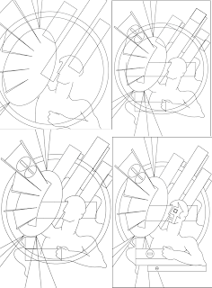
these are some printscreens of the drawing process which i began by mapping out all the block shapes ( starting with the ones that were already in the tool box circles rectangles etc) before i began using the pen tool to intergrate the curved lines of the man. the man was by far the most complicated part of my design so i left him till last which gave me time to fully establish my background. the white arrow tool was a lifesaver when drawing the curves since it allowed me to adjust the anchor points which helped to generate some clean lines. so far it looks good but i havent started on the hard part: colouring in!
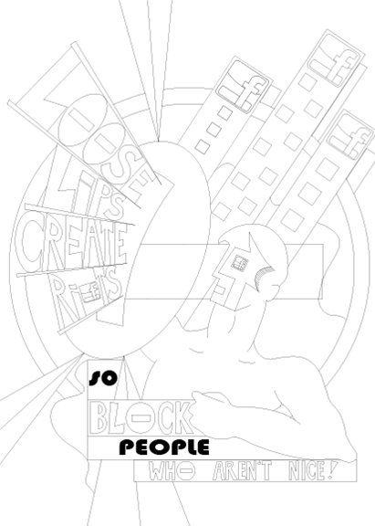
Final Design idea

This is my final design the scan on the left clarifies the basic shapes of my poster whilst the one on the right introduces the colour scheme. i intend to live trace my scan in order to create the base for my poster which is why i havent included colour. im really happy with the design so far in terms of shape and im excited and nervous about translating the colours and textures into illustrator since theyre integral to the design.
The Slogan
Although i was fairly sure that i
wanted to design a poster revolving around the block aspect on Facebook it was
really cemented when i started creating slogans. i tested out a few others
using different aspects from other sites for example i had - "youtube,
most viewed share and share alike!" which would promote the 'share'
icon on youtube which i liked rhythmically but i didn't think that it really
related to propaganda slogans. since i liked the rhythm of my slogan above i
decided to try and come up with a slogan which advertised the block icon using
a similar rhythm but had more of a contextual reference. in my research i came
across the artist Steve Thomas whose office propaganda posters featured a
slogan taken from an American propaganda poster.

"Loose lips, create rifts so block people you don't like!"
I was fairly happy with this slogan until i realised that the "block people you don't like!" was a little judgmental and seemed to be encouraging people to block anyone which wasn't really my aim. my aim was to advertise the block symbol in terms of protection ( if your'e being hassled or are a victim of bullying then you block them ) so because of this i had to change the last phrase whilst still retaining the correct rhythm . i then came up with what i think will be my final slogan:
"Loose lips, create rifts so block people who aren't nice!"
i was much happier with this slogan, it conveys my overall message and seems to be a lot lighter than some of the previous slogans researched (probably because it lacks a direct imperative) its subtle but its understandable which is the most important thing.
The Pitch
The pitch went well - it was interesting trying to explain my development to
others it helped to clarify my design ideas and helped to ensure that i hadn't
strayed too far from the brief.


The response to my final design was very positive, the only thing to
consider was my font choices and whether i stick with a basic hand drawn bubble
font rather than a similar font taken from my spanish propaganda poster. i plan
to try out both before deciding but i think that my peers were correct and a
more spanish curled styled font would detract from my overall design.
The design above is what I've come up with so far i'm really pleased i think
i've successfully managed to combine the spanish propaganda poster style with
Facebook's modern aspect and the modern work of propaganda artist Steve Thomas.
i've included the angularity of the spanish character and kept the block
colours and placed emphasis on shape but i've also included the block symbol
shield ( inspired by Steve Thomas' virus poster) and altered the colour scheme
to ensure Facebook's representation.


Tuesday, 9 October 2012
general intresting spanish propaganda posters artists unknown
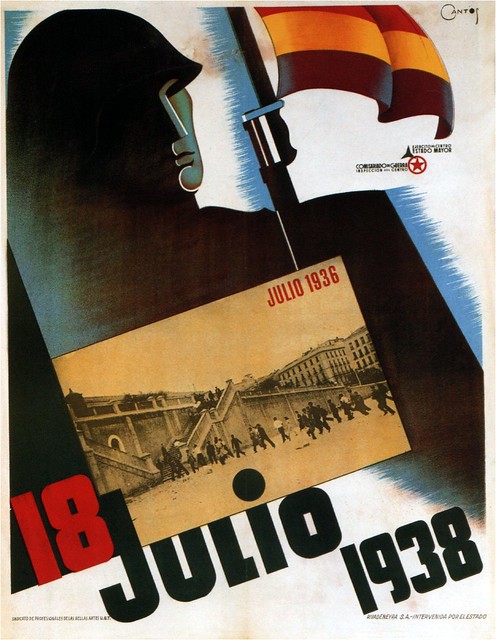
18th July 1938
i love the angularity evident within this poster its simplicity makes it a lot more effective and more visually striking theres also a lovely gradient which drags the eye diagonally across the frame. and the soft brush strokes break up the white background whilst also highlighting the diagonal positioning.
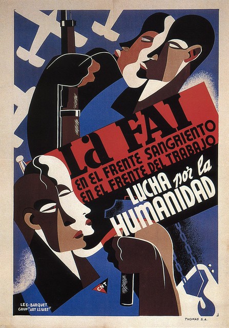
anarchist federation 1937
it is the people that i like the most in this poster there faces are defined by the abstract shape and i love this flat style which elucidates the fluidity of the curves on the face. the colours work well together the browns contrast with the background outlining the silhouettes. although the faces are curves there is an angularity which is congruent with a lot of the other spanish posters already researched.
http://www.dieselpunks.org/profiles/blog/show?id=3366493%3ABlogPost%3A187587&commentId=3366493%3AComment%3A187499 ( all posters above)
Carles Fontsere

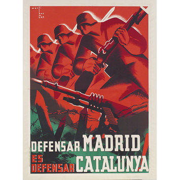
this design is less simple than the one below although there is an emphasis on shape this poster is a lot busier than the one below whilst, the other is dominated by one single element: the tank, this poster seems to be segmented into three -the woman at the back, the ambulance and then the foreground trenches. this segmentation directs the eye up the frame to the female figure and the heading which obviously establishes the overall message " ambulances to the front". there is a hand drawn feel to the top of the poster which softens the shadow (an almost halo around the head) and provokes contrast with the bold oblong ambulance and the vibrant red outlined trench. i don't really like the mustard sienna colour in the background just because its very dark and i prefer the brighter reds but it does create a plain bland background which doesn't interfere with the rest of the poster.
http://www.allposters.com/-sp/Ambulancies-Per-Al-Front-Posters_i2915937_.htm

i think that this is one of the more effective Fontsere posters mostly because i really like the colour scheme- black white and orange which keeps both the design and the message incredibly simple. the bottom slogan "crush fascism" places this poster within the communist movement and i love how Fontsere has represented this "crush" visually through the tank. the monochrome tank itself is the main focal point its realism contrasting against the block orange background. the soft white edging softens the solid orange as it approaches the tank which effectively outlines the tank elucidating its shape. Other than the colour palette used i'm not really sure if i could use any of the aspect in my design ( my own concept revolves around blocking what people say) but i guess i could use the tank as a representation of the block symbol.
http://www.allposters.com/-sp/Our-Common-Objective-Always-to-Squash-Fascism-
Posters_i7862333_.htm
Monday, 8 October 2012
Jose Bardasano

1937 communist poster
My favourite aspect of this poster is the silhouettes at the bottom, the hands and hooks initiate an intricacy which breaks up the black line. the purple softens the outer edge emphasising the hooks whilst contrasting against the brown gradient. the red hat is the central shape which draws the eye inwards the flags all provoke a sense of movement and effectively fill most of the top half which keeps the socialist message clear and understandable. as a whole the poster isn't one of my favourites but i think it works in conveying the working force and i do like the vibrancy of the colours used.
http://farm8.staticflickr.com/7056/6947557235_067451c980_z.jpg

1937
This is one of my favourite Bardasano posters - i love the complimentary greens which elucidate the shapes of the soldiers and contrast with the black print at the bottom. the poster seems to be divided into layers the light green background creates the base, the darker soldiers fill the frame centrally and provides focus whilst the black silhouettes at the bottom instigate balance. there is a sense of repetition through the soldiers which initiates a directionality and theres a softness to the lines and shapes which i haven't really seen in previous posters. i prefer the angular designs just because they have a higher contrast and look more striking which i think is very important in conveying message. im not sure whether i could use aspects of this design for my own ( possibly the silhouettes at the bottom) simply because i plan on placing a lot of emphasis on shape ( to fully establish my block aspect) the poster above revolves the fighting force rather than anything symbolic.
http://lh6.ggpht.com/-sT5Hv4E60m4/UAu1LmEMTII/AAAAAAABzac/7Od9k6uq-XM/Jose%252520Bardasano.%252520Communist%252520Propaganda.%2525201937_B.jpg

it seems to be very common in Bardasano's work to manipulate the line of silhouettes along the bottom of the frame- they create a simple background which simultaneously frames the design again incorporating balance. the bright red is clearly a reference to the communist or socialist party which portrays meaning and i love the sense of light and dark which is particularly evident on the hand and incorporates a sense of depth. the gradient at the end of the arm instigates movement directing the eye up to the figures who occupy the centre of the design. the background is segmented in two and dominated by white which generates an effective backdrop without interfering with the main design.
http://lh4.ggpht.com/-j7dsYa-kfGM/UAuzq30t8UI/AAAAAAABzaM/EUoaNOIQuF4/Jose%252520Bardasano.%252520Communist%252520Propaganda.%2525201937.jpg
i think this design has the most potential in regards to my design ( my slogan loose lips create rifts so block people you don't like) would work against the open mouth ( lips and rifts). the brush strokes soften the colours used integrating texture but the manipulation of the block colours keeps the overall design very simple. the solid colours are bright and loud which is congruent with the message and the open mouthed figure.
http://farm8.staticflickr.com/7176/6947553781_48105be4e3_z.jpg
Friday, 5 October 2012
Goni Lorenzo

1936- united socialist party
The use of block colour and silhouette places a lot of emphasis on shape- the curve of the fist directs the eye upwards, the filled brown shadowed by the thick black edge generates both shadow and outline. the blurred edge of the white which surrounds the central figure gives the poster a cut out element which also outlines the main figure simultaneously the harsh contours of the face. the use of the left fist relates to political position this is a socialist poster ( so its promoting the freedom of the people who are represented through the faceless man). Again the bold lines and angularity can be translated into my own design - the raised fist could contain the block symbol ( the aspect of web 2 i'm currently toying with) and i could even place the Facebook logo in the background like a flag.
http://media.iwm.org.uk/iwm/mediaLib//192/media-192897/mid.jpg

1936
It is the repetition in this poster which i think is particularly eye catching the straight square faces introduce directionality forcing the eye diagonally down the frame, and there is a clear sense of balance to the image; the square of text is balanced by the five planes in the top corner, even the four figures segment the poster fairly equally in half. again the same brown colouring has been used as in the other ( as its part of a series this brown cements the continuity which in turn cements message). there is a sense of light and dark which is again stipulated by the black outline though unlike the other this poster lacks the soft gradient which keeps this poster exceptionally sharp and clean. personally i think another colour would have been more striking as it would have provided more of a contrast but i still think this poster is visually effective.
http://media.iwm.org.uk/iwm/mediaLib//192/media-192836/mid.jpg
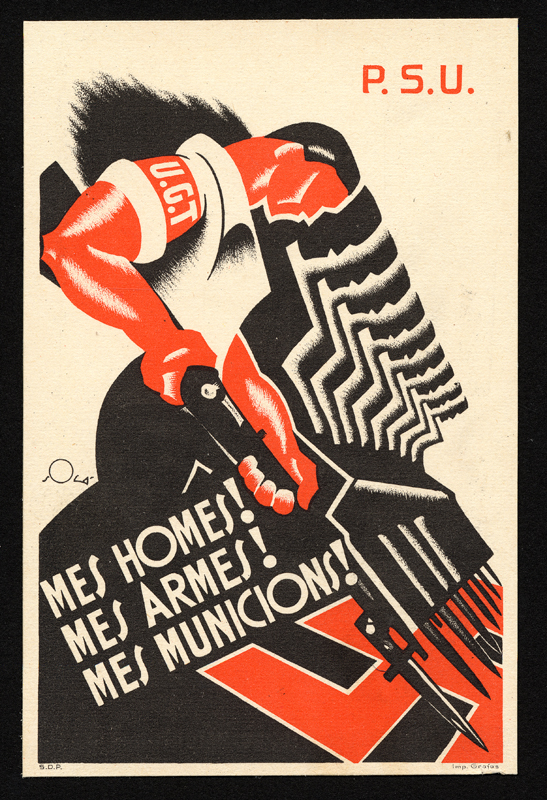
i think this is one of my favourite Lorenzo images because i love the stylistic silhouettes that help to frame the first figure. theres an almost hand drawn effect introduced through the gradient which softens the angular faces and incorporates a sense of movement. its clearly very much against Germany which places the poster again within the socialist party the blocks of black and red are framed with white which helps to emphasise shape. and i really like the blurred smudge in the top left corner which looks comparatively empty highlighting the P.S.U logo.
http://libimages.wolfsonian.org/XB1994.189.8.000.jpg
Spanish Propaganda posters- initial research
After looking at some general propaganda posters from the specified period, i found that the most intresting posters and the ones that i thought were more effective were the spanish propaganda posters so i decided to do some further research into this area ( i created a mood board of spanish propaganda posters in my sketchbook) and before finding specific artists i wanted to explore some general posters to investigate the various styles before focusing on certain artists.
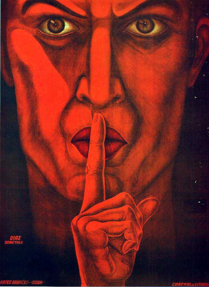
The poster above is very striking, the whole poster is filled with the portrait, the severe expression is very dominating ( a keep quiet spies poster perhaps i couldnt find a great deal on it) and i thought it related to the aspect of web 2 that ive decided to focus on (the block button on facebook) i could replace the finger with the block symbol and place my slogan at the bottom of frame possibly using shades of blue to reference Facebooks logo. orange and red however seem to be used througout spanish propaganda ( the flag colours) so in order to remain as close to the propaganda posters as i can then it may be an idea to use similar colour schemes.
http://24.media.tumblr.com/tumblr_m64dtv7ZBp1rubozqo1_1280.jpg
http://si.wsj.net/public/resources/images/OB-SP029_spain_DV_20120413170305.jpg

"in spain it is dawning, arise spain- supporting the far right movement"
the repetative silhouettes are the first aspects that draws my eye, the faceless figures represent a large part of sociey and the raised right hand indicates political positioning ( republican). the use of three tones keeps the poster very simple which effectively ensures an understandable meaing. again reddish orange in the background refers to the spanish flag. the emblem in the centre combined with the raised hands directs the eye up to the top heading- in terms of my design i could replace that central symbol with the block symbol, place my slogan in the four lines surrounding it and i could even place the facebook logo onto of the faces to instantly place the characters within that site.

http://www.referenced.co.uk/propaganda-posters-from-the-spanish-civil-war/
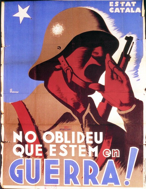
1937
the contrasting colours are the dominant element within this poster the red is vibrant and combined with the armed defense has connatations of violence. again the faces are very square and stylised (which i definitly plan on using within my own design) the repeat of which directs the eye diagonally along the line. i think the message of the poster is depicting the defense of madrid which is congruent with this line of soldiers and the barbed wire.
http://media.vam.ac.uk/media/thira/collection_images/2006BB/2006BB5444_jpg_ds.jpg

1977 (republican poster)
http://si.wsj.net/public/resources/images/OB-SP030_spain_DV_20120413170431.jpg
Although this poster isn't within the 1900-1950 era i liked the face and the closed lips and instantly began thinking of my block aspect. i could replace the cross with the block symbol - use orange over the face to relate to the 1930 spanish propaganda and i could put the facebook logo in the background. the angularity of the portrait is very reminicient of the propaganda ive been looking at so i think the poster emmulates the 1930s propaganda enough to be refered to when im designing. again its the posers simplicity which draws me in ( i can understand its message even though i cant read the writing) which i think is an essential aspect of propaganda posters.
Tuesday, 2 October 2012
Steve Thomas

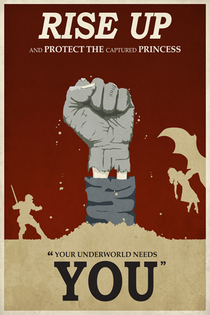
There is a very distinctive medieval theme in this poster from the heroic knight and evil winged dragon right down to the swooning damsel in distress all of which elucidate the fantasy element. the poster is a fun representation of the classic battle between good verses evil which is a well known and understandable concept. Even the central positioning of the closed fist divides the frame in two highlighting the good Vs evil theme. the solid red background frames the grey hand and yellowish silhouette; silhouettes seem to be an exceptionally common theme within propaganda posters they ensure a broad target audience and clarify the overall message because the concept or message has not been convoluted by excessive detail. the bold phrase "rise up"and the one word "you" successfully conveys overall message whilst the capital "protect the[...]princess"emphasises the objective. the closed fist is an emblem that i found within an American ww1 propaganda poster and i love how its been modernised and adapted to fit this promotional game poster something i will consider when designing my own poster- using iconic or well known emblems and adjusting them can be incredibly effective in modernizing the propaganda style.
http://www.ww1propaganda.com/sites/default/files/3g03349u-1591.jpg?1311563397
http://24.media.tumblr.com/tumblr_m8zffxJ1P71rn4obco5_500.jpg

I love the fantasy element within this poster (the flying ostriches and the medieval armour) are incredibly fun and light. My eye is instantly drawn to the stripes which direct the eye outwards from the Knight to the heading whilst simultaneously creating an interesting backdrop which contrasts with the red ostrich.
The poster itself is reminiscent of the world war 1 enlist propaganda posters- yellow (a popular colour used in the posters generated in ww1) again instigates a sense of glory and nobility which is further stipulated by the knight character. The block colours are only broken up by solid sections of slightly lighter tones which gives the poster a cartoony style which coincides with the fantastical theme. the exclamation mark after the 'enlist now!" softens the command, its friendlier than the directives in the previous posters researched and manipulates humour to inspire action rather than horror.
http://brian.carnell.com/wp-content/uploads/2011/01/joust-propaganda-poster.jpg

although i plan on basing my own designs on spanish and russian propaganda style posters i love the fun fanstasy elements within Thomas work and his modern interpretations of propaganda posters.
http://www.acustomposter.com/wp-content/uploads/2012/09/rivendell_final_small.jpeg
Monday, 1 October 2012
Aspects of Facebook,Twitter,Flickr and Youtube
I'm choosing to focus on the aspects of the 4 sites Facebook, Twitter, Flickr and Youtube simply because i'm more familiar with them than the others, hopefully exploring the aspect will help to give me a clearer design direction.
Facebook
News feed
instant messaging/ chat
message
subscribe
listen with friends ( sharing music)
status
activity log
check in
poke
notifications
comments
timeline
like/dislike
mobile
Groups- closed and open follow ( limited to 300 people)
photos- albums
block
events
Youtube
repeat
most viewed
share
subscriptions
my videos
playlists
top rated
upload (15 minute duration)
play back
dislike/like
comments
mobile
featured
history
Flickr
groups
picnik-photo editing ap
200 photos ( if more are added then only the most recent 200 are displayed)
upload 300 Mb of images
only 2 videos per month
Twitter
following/unfollowing (friends and celebrities, actors musicians etc)
trend
twitter list
messages (character limit)
mobile
publicly visible tweets
i've highlighted the ones which i think look more interesting and could promote some more interesting slogans. i'm ruling out Flickr just because i find the site a bit bland in comparison to the others. so far the block symbol on Facebook is the most intriguing aspect at the moment so i'm probably going to make that my starting point.
News feed
instant messaging/ chat
message
subscribe
listen with friends ( sharing music)
status
activity log
check in
poke
notifications
comments
timeline
like/dislike
mobile
Groups- closed and open follow ( limited to 300 people)
photos- albums
block
events
Youtube
repeat
most viewed
share
subscriptions
my videos
playlists
top rated
upload (15 minute duration)
play back
dislike/like
comments
mobile
featured
history
Flickr
groups
picnik-photo editing ap
200 photos ( if more are added then only the most recent 200 are displayed)
upload 300 Mb of images
only 2 videos per month
following/unfollowing (friends and celebrities, actors musicians etc)
trend
twitter list
messages (character limit)
mobile
publicly visible tweets
i've highlighted the ones which i think look more interesting and could promote some more interesting slogans. i'm ruling out Flickr just because i find the site a bit bland in comparison to the others. so far the block symbol on Facebook is the most intriguing aspect at the moment so i'm probably going to make that my starting point.
Subscribe to:
Posts (Atom)