
poster created by Frank Shepard Fairey
In my initial 1900-1950 research i found that the posters that i found most effective were generally the ones that used 2 or 3 main colours, so i decided to try and find a modern equivalent. The colours are again contrasting and bold, they simplify the face and divide it into light and shade the reds and blues are very American which obviously concurs with the subject matter. The dark navy creates shadow and offsets the slogan, the font of the text itself is easy to read its simplicity is mirrored in the one word command, the message is clear and understandable "CHANGE". obviously because its contemporary the lines are sharper, and the portrait although stylistic is more realistic than those previously researched. i espescially like the lines which help to construct shadow and help to diverge texturally another modern touch which i will consider when designing.
http://www.gwennseemel.com/images/blog08/ShepardFaireyChange.jpg

Poster art Steve Thomas
Again minimal colour manipulation, these seem to have a slightly more angular feel (bottom left espescially) an aspecept i found intriging when looking at the Spanish civil war posters. Out of the four i think that its the bottom right which draws my attention the most. The white of the water tank covers a larger area and seems brighter against the red possibly due to the thick black outline and shading, its central positioning focuses the design and the eye is led vertically down the frame to the remaining text "gossip ends with you". The "loose lips" phrase refers to an American Propaganda poster "loose lips might sink ships"the message efficiently cemented by the use of rhyme. This intepretation has continued with the near rhyme "create rifts" which is still just as effective at imparting the overall message.
The poster top left is another favourite (and refers to social network sites which concurs with our brief). I appreciate the subtlety evident within this poster it seemingly alludes to Twitter but although the message is clear it is not made explicit- theres no twitter logo but it is suggested by the bird. The black bird is the main focus as it is exemplified by the plain red background and i like the curved line of the bottom phrase which makes it stand out against the rest of the design.
http://johngushue.typepad.com/.a/6a00d83451f25369e2014e88233f0b970d-800wi

Im not sure if these would be considered propaganda posters but they have a distinctive russian propaganda like style and they are promotional advertisments.
http://www.designcontest.com/assets/galleries/3564/Soviet_Propaganda_poster_by_dmavromatis.jpg
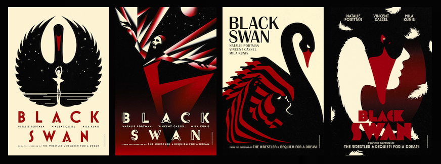
Black white and red have again been used again and they again create brilliant contrast exemplifying shape. I love the angularity of the top right which is reminicient of the spanish propaganda poster i previously researched. the straight bold lines are incredibly directional and dramatic and it seems yet again that it is its simplicity which makes it so striking. The faces in each are flat and silhouetted which i think makes the design more seamless and definately ensures the continuity throughout the four. The top left is very contained within the white which i also think benefits the design, its centeral and the white fully conveys the wing shapes. Wings which in turn frame the central figure neatly drawing the eye to the Black Swan title.
http://www.theballetbag.com/wp-content/uploads/2010/11/BSthumb.jpg

This poster was created during the Cold war so its not exactly modern but its dated 1970 after the specific 1900-1950 date given in the brief so im putting it in this section. limited colour useage and manipulation of a silhouetted figure (common themes seen throughout a lot of the propaganda posters researched). No foreign words or slogans just the name Lenin which ensures a broader target audience, though without the added clarification of a slogan the design is made solely responsible in conveying message. The red is the most eyecatching aspect so i can assume that the poster is promoting Lenin, the eye is then drawn diagonally down frame to the man whose lack of distinctive features confirms the wider audience. There is a sense of light and dark which helps to break up some of the block colour but i find that i dont like the brown washed background which doesnt look as stark as a solid colour would have. As i have discovered in my previous research i think black would have looked more dramatic and striking than the brown does. overall i like the stylised figure but im not too sure on the brown and its a little bland.
http://www.designer-daily.com/wp-content/uploads/2009/08/lenin.jpg

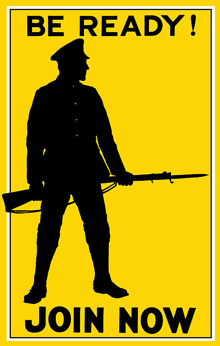
i think that this poster is a little more fun than the others ( obviously because its purpose is fairly light). The simple yellow block background contradicts the more textural appearance of the figure which has a nice hand drawn feel, hes very simple in terms of shape but theres a sense of depth introduced through the shading. the use of the exclamation mark at the end of the phrase "use your library often!" gives it a more friendly vibe ( which completely differs from the harsher commands seen in other posters this distinction again is down to the message). the figures pose very practically, directs the eye down to the "KNOWLEDGE" which efficiently assures full message transferal.
http://rlv.zcache.com/for_greater_knowledge_use_your_library_poster-r49b795a049c946138e7824ee6f703e47_ai4d1_210.jpg

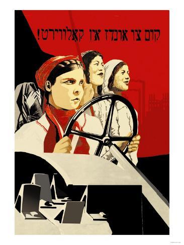 "Drive to the collective farm"
