Friday 28 February 2014

Kevin Mcclouds Opening Titles...

So originally I wanted to do a photographical element like Kevin Mclouds opening title sequence below- however the photograph element was shot down by the client (I dont think what I showed was quite right either). Despite this I love the amount of fun injected into the sequence and the transitional cuts and zooms that keep them dynamic- I find them very inspirational!


Contrasting bright cartoony visuals with photographs injects a lot fo humour!

an almost stop motion use of expression- frowning cut to cheesy grin!

I wish I could use photographs within the animation but this has been shot down! Having said this my aim is to inject some fun- I am going to make the sequence fun and light and funny if I can in order to make it watchable.

Storyboards and Sting ideas

 I would make the above world for the overall animation but I would like to use the whole thing as a sting since i could have it role in frame and light up...

So I made this storyboard- its based heavily of the London international film trailer previously researched.

Ive tried to explain it all below 

So the first shot- would be all the presenters sitting on there moped (7 is a lot so a few of em are going to have to be background figures) looking at the Welcome to Brighton sign which would be framed with lights (las Vegas style)

It would be really good if i could get- hair colour/style and skin tone of the presenters - since we decided to put goggles on them those are the only other defining characteristics Ill need to create people that look a bit like them. (obviously the style means it wont be exact and ill try and keep the figures failry generic so if they ever leave it wont effect the titles)

The second shot would be a cut to a stylised Brighton map- with the welcome to brighton sign visible at the top and 7 red dots shaped like an arrow near it (so its like the start of the journey)

The third segment in my head would be like the video i sent you in a previous email- there would be one presenter (i know i put three in the board but I wanted to discuss this with you) the curved world would be spinning- to the first landmark - the duke of yorks. there would be other paper cut out background detail which would be almost silhouetted. The duke of yorks would have all the windows alight. The background sky in this shot would be sunset colours.

The next shot would be a close up of the legs im not sure whether a cut or a zoom would be used, I would place lights (either wrapped around the legs or framing the outside shapes) that would individually light up (ideally to the music), the sky is still sunset.

In the next shot it would cut to the curved world - this times the presenter would be different- im thinking one presenter per landmark. the next landmark i have on the list is the clock tower but im not sure if this is right - i did my best to plot the route via google maps! anyway the same principle as the previous curved world shot (an idea taken from the vimeo vid) it would curve round as he the new presenter travels forwards to the clock tower (i know they put lights up round it at xmas so ive included these). The sky is getting darker so its a darker sunset with some purple/blue in the sky. 

Then the close up of the clock tower with all the various lights lighting up one by one.

cut to Another curved world shot- different presenter, darker sky- its a twilight sky now all predominately purple and blues with only the slightest hint of orange. this location would be the north laines sign (again im using this one cause i saw it at xmas and it would allow me to light up the words) 

cut to the close up of the sign lighting up.

cut to the curved world, different presenter- darker sky still - maybe a few clouds to break up the space- to the brighton dome

cut to close ups of the windows in the dome lighting up

Cut to the curved world seafront - i was thinking those colourful beach houses- dark sky few stars - different presenter again 

cut to close  up of the houses lighting up one by one

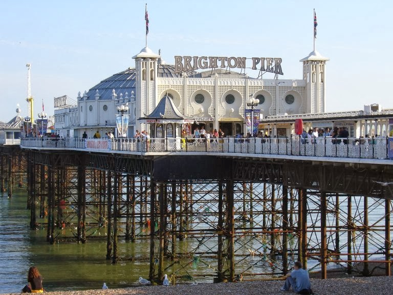
curved world pier- different presenter- navy black sky stars and moon 

cut to close up of the pier lights

then like the beginning all 7 presenters staring at the latest music brighton lights sign- cut to the above shot of the map with 7 dots all at the end of the journey next to the sign. Then a zoom into the Brighton Lights words would be the end.

If I dont have enough time to do all these locations I would ideally liked to cut out some of the locations and then put two presenters within one.

So far Im happy and want to start making but I am waiting on Vals approval!


Wednesday 26 February 2014

Figuring out the route


I wanted to figure out the main order for all the selected landmarks- I have google mapped all of them to the best of my abilities- and come up with the following order:

Welcome to Brighton
Duke of Yorks
Churchill Square - with the clock tower
North Laines
Brighton Dome
Seafront-Pier

Tuesday 25 February 2014

Brighton Landmarks...


Val has given me a list of some of Brighton's landmarks that she wants me to try and include within the animation. Ive also incorporated the Brighton Pavilion (the pavilion in the north laines) and the colourful beach huts along the seafront (which I plan on asking about but they are in a lot of Brighton themed artwork that I have looked into). The bandstand and the carousel along the seafront could also be additional details to include.

 The St Peters church at the bottom of the North Laines in the quad area.
 High heeled stripy legs atop the Duke of York Pavilion (the legs remind me a lot of the witches legs in the wizard of oz).
 Clock tower near Churchill square
 The main pavilion (the one that I think is more well known)
Brighton Pier
The lights of the pier- Brighton Lights is the name of the programme so I definitely feel its prudent to include lights.
 More seafront


 The beach huts that dominate so much of Brighton's seafronts.
 The opening to the North Laines.


Ive narrowed the list down into 7 aspects- one for each presenter that I am supposed to be drawing - although I may actually have to narrow it down depending on time. My idea so far would be to use the a spinning circular base- divided into 7 sections (one for each landmark) Ideally the round world would spin and there would be a side on presenter riding the moped round the section. I would like to cut the round spinning aspect with some close ups of the landmark and then cut out to a different presenter in a different location. It would then end with a zoom out (I'd like the circle to actually be in the shape of the Brighton wheel) to the Brighton Lights sign which would be the logo for the show. I would also then use this logo as one of the stings.
Brighton Pier
Brighton Pavilion,
Brighton Seafront,
Clock Tower,
North Laines
Brighton Legs (Duke of York)
Welcome to Brighton Sign

Retro Opening Titles...

I wanted to try and find opening titles that were animated to see if there were any tricks that I could utilise. However I actually found it really hard to find any that were animated and made up of illustrations. I did however find the opening title sequence for a programme made in the 60's (I was going for a 60's retro style and it was interesting to see the visuals to programmes that were actually made in that era). The stop motion photography element to these titles looks fun and matches the feel good happy music background,  the manipulation of shape and cut out elements gives it a simplistic air and though there are moments of pacing that are clunky and slow there is a nice sense of fluidity to the cut out pieces that pop onto screen in sync to the musical beat.


The video below is the opening title sequence to 'party classics' it has a great retro styling and I really like the range of movement, the smooth transitions made by expanding background fill shapes is fluid and keeps the pace up which keeps the animation interesting. The I really like the music change during the piano scene and the swinging disco ball that allows for the introduction of the record. Shapes are a major part of the illustration, aspects and transitions and it is something to consider within my own work since the shapes ensure the overall continuity and are reminiscent of the era.


Daniela Negrin Ochoa Illustrator and Animator...

I really like the London Animation festival trailer so I decided to look into more work by the Illustrator and Animator that was responsible for it. Daniela Negrin Ochoa is a London based British Animator that has a very distinct style- one that I very much like and one that is reminiscent of my own moped girl designs. The cut out style in the video below is lovely. Blue red white pink and black are the only shades present within the animation and I love how the world looks because of it. Small details are introduced in a hand drawn cut out style and they help to ground the very cartoony world. The manipulation of flat shapes (the cups and food perspective is sideways on rather than an above view) is a little odd at first but it definitely concurs with the cutout world and it really emphasises the shapes. There is a great deal of humour to the xmas card and a simple pan up motion which shows of the full extent of the illustrated world.


The bright retro style cartoon in the animation below is very bold and arty, but it is the smooth transitions that really holds the attention. Swiping the entire scene into frame is an effective way of communicating movement and I like how this movement also mimics the simple flat style and the advert. Each swipe contains an object that is then followed through into the next frame which helps to ensure the overall continuity and ensures that theres always something for the eye to focus on as the scene changes.


I love the retro theme throughout her work and I plan on utilising the revolving movement that was in the  film festival trailer with small cuts and possibly the sliding screen transitions from the video above. It nice to see that a more Illustrative style works well when animated since I so far only have a character drawn out.

Val's response to the styles...

Val seemed really pleased with my style ideas- she didn't like the photograph idea but that was kind of expected. She did however like both of the other 2 styles that I presented stating that I was definitely on the right track (I'm not sure if this is actually code for still not right or she actually is happy with where I am taking this project). Despite my design paranoia she seemed genuinely pleased- although she said that I need to slim my women up since they have a pear shaped body to them- which I will do when I start making all of the design parts. My task for this week is to create a coherent storyboard for the animation. I have primarily been focusing on drawing out people on mopeds since they are the main part of the design but now I am actually going to have to look into all the various locations that need to be included and figure out how I'm going to make the animation and the moped location journey interesting.

My Style Variations...

Val wanted me to present her some styles so that we could decide on a style quickly and not have to worry about it. After looking into a lot of pictures and artworks I decided to go with the retro theme that was so prominent throughout much of the work already researched. I felt that the designs should mimc Brighton's quirkiness and colour, it should reference its history - Brightons Rocks Mods and Rockers instantly sprung to mind. I wanted it to look and feel fun and cool. Val had already stipulated that it should be sleek which I have chosen to interpret as less fussy than my normal style. I came up with 2 main style presentations with a 3rd idea that utilised the artwork from the 2. I also created some additional cartoon faces just incase the styles presented weren't what Val was looking for.

 I made the overall figure in Illustrator using flat vectors and careful lines to produce the shapes. I realise now that I need to refine the moped a bit- the white circles in the wheels look far to bright in comparison to the rest of the design. I primarily used the pen tool to generate the lines of shading - It was a guideline I set myself in order to keep the design smooth and sleek. Although I broke this when shading the eyes and mouth.
After I finished the Illustrator graphic I then decided to experiment with texture in Photoshop- a simple drop shadow helped to raise the figure off the background whilst an additional film grain gave the character a paper like feel which I think will help me because it situates it in a raised layered world which provides depth but also keeps it simple.  I also then altered the contrast a little bit just to give the character a sense of darker tone, and placed it on a orange circle background just to see how it would look with additional detail behind it.

 The red black and white style- was brought about by the Latest Tv colours, I wanted to see if it would look any good in black and white and though I definitely think the grain texture and drop shadow should be added to it in order to make it stand out a bit more- the combination is surprisingly effective- I actually really like the skin tones in monochrome since they look very soft. I do think I prefer it in colour but I think I will make that decision after talking to Val.

The screenshots above are what I produced as one style, I experimented with texture colour and shading in order to really see what would work best. It is primarily based off the artwork below (British Artist Peggy Wolf). I wanted it to have a 60's retro feel and I think I have managed to create this through the overall styling. 


Since my first style had a more realistic appearance. I opted to create another style with less going on- I stripped the features away to the simple shapes made sure to use no brushes whatsoever and decided to use a simple white line stroke to separate the limbs- the black outfit a reference to the leathers used  when riding an actual motorcycle helped to refer to the Rockers aspect- whilst the scooter and the bright styling the Mods. I integrated goggles because I didn't want to fuss too much over features. Practically I have no idea what the presenters look like and I didn't want to make them look too similar because I thought that a more generic person would work better.  Once again I added a similar film grain and drop shadow in Photoshop simply because it was so effective in my last moped girl attempt.  


 I incorporated a fuzzy brush to help incorporate a sense of outline- the girl is framed by the white and it helps to texturise the background- In the actual animation if this speckled brush was used I would use it to line the edges of the buildings and the background.


I experimented with red backgrounds since thats the Latest Tv colour scheme and actually liked sticking to the black red and white shades- It would be cool to create the whole world in this style although of course I would like to integrate some vibrant electric blue to introduce points of contrast. The styling is similar to my last one but it is a lot more basic- It was also less time consuming to draw due to its overall simplicity.


I wanted to try introducing a photographical element to the overall design to see how effective it would be, that way photographs of the presenters heads could be carefully cut out and placed ontop to give them a comical and collagen feel. I'm not entirely convinced that it would work - and Im not sure if this is really what Val would be looking for. Having said this It would help to create the cutout theme which I am leaning towards. 

These are some quick additional cartoon faces that I produced just incase Val wants a more hand drawn style than she thought. I did them very quickly so they are by no means perfect but I thought that I would include them as an extra just in case.


Peggy Wolf - Visual Style

The yellow image with the dark haired woman found on Pinterest and a source of inspiration was created by artist Peggy Wolf. I wanted to investigate her other pieces to see if they would give me any more inspiration, since I found the one image incredibly bold, retro and useful in my own designs. 

 Most of her work features beautiful females with a stylistic and wonderfully weird edge. bold smears of colour create the featured blushes. I also really like the delicate lines incorporated within eyebrows, hair and eyelashes since they break up the bold fills and strokes. Wolf generates her work by using a mixture of illustration and digital collage. I love the lips in the piece above and the carefully integration of very dark shadows onto an pale face.


Im not sure if I actually like the pink background lady above but I definitely find the work striking. There is a great sense of colour that form a variety of shapes- and though it doesn't strike me as 60's as the first piece I looked at did this one does have a sense of retro weirdness about it. I actually like how the disproportionate aspects create such a striking character. The eyes in particular draw the main focus. I also like how despite the weirdness and the very non realistic characterisation of the woman there is still a sense of real life tone which gives it depth.

Although I will be creating an animation I would very much like to take elements out of Wolf's style and put it within my own designs.

Monday 24 February 2014

Additional Style Ideas...

I found these images that I think really emulate the style that I am going for. I love the cutout model below which is one of my favourite- the physical model helps to give it a sense of 3 dimensionality. I may or may not try to replicate this it depends on my time limit.
There was something very bright about the images above that I liked- the use of shapes have been emphasised by the colour use and I really like the little planets in the very bottom image that break up the night sky and have a lovely cartoony style.


Cutout Paper Animation Research...

I liked the cutout style found in some posters already researched so I decided to see if I could find animations that referenced this style so I could see if there were any cool transitions that would work with this project. The transitions in the Starbucks advert are smooth but are simple enough for me to recreate. Theres a sense of panning which could possibly be replicated and that provides the link between each scene. The tree grows upwards from the girls ears and allows for the movement into the new scene with the guy on the street. The overall style has a 50s cartoon element and the cutout characters are bold and theres slight jaunty movement to the hair and hats which helps to create a more fluid sense of movement. The jauntiness gives it a jolly feel which further matches the cutout aspects.


The video above is a character-song animation. I like the movement of the hands which have puppet joints that separate them from the rest of the arm giving it a quirky feel that is further emphasised by the cutout paper character. The timing is obviously spot on because it has to match the music but its got a great fun feel.


I actually love the variety of shots within the video above- the spinning globe helps to convey a sense of perpetual movement whilst additional close ups break up the spinning and fully convey a great sense of Britishness. The birds flight matches the music which is particularly evident within the spinning world moment. The ending is also lovely in its sense of continuity as the bird flies within the screen and completes the animation. The style is something that appeals to me but obviously wouldn't work for Latest. I would love to try and introduce a spinning element within my own title sequence since I think that it would work well in helping to provide a sense of place and movement without being a continuous linear journey.

Research Continued... Brighton/Mods/Rockers...

Since Brighton is a key element I decided to research images and pieces of art that depicted Brighton and the key elements within it.

I found this Brighton drawn above- the line drawn is very detailed and I love the typography element thats evident within the poster. It is essentially a line drawing but the use of bold black fills help to break up the mass of detail and provide a sense of shade.  I like the incorporation of the wheel which has since become a somewhat well known piece of Brighton.

Mod's and Rockers are an iconic element of Brighton history and my brief specifically references this element. The poster above is a part of the mod/rockers series the blue poster previously researched was a part of this series. I love the red elements which really help to warm the image. The black and white elements are very striking, and I like how the text element is an extension of the overall theme. The man reminds me a lot of Danny from Grease and I love the sense of seduction and swagger thats conveyed through character posing.
The drawing above of is off the beach huts along the seafront- the line style combined with the use of block colour gives the whole image a cut out feel.  The block colours contrast against the thinner outlines - something to consider within my own design...


I really liked the cutout theme in the last image so I thought I'd look into it a little more and found this paper cut out image above which I think has a lot of design potential. The shadows could be replicated in Photoshop or Illustrator and I love the smooth simplicity of the characters- the shapes used are simple but the separation of the elements and the shadow element helps to create the impression of layers. Since I've been asked to create a smooth sleek style (a style out of comfort zone) I think that using this cutout idea will help me to create something sleek as well as allowing for the introduction of some much needed quirkiness. 

Initial Style Research...

I really wanted to establish a strong visual style early on, not only because Val the client wanted an indication of style- but also because I want to cement this so I can spend more time animating. I ended up turning to pinterest to try and find some inspirational designs. 

The painting above is very retro, I like the how the shading is very textural which breaks up the face and provides a sense of depth. The mass of hair would be very dominating but it has been softened by thin strokes that integrate a sense of detail. The eyes have a great deal of impact due to the black outline and the long eyelashes, and I love how the mass of black is broken up by vibrant colours that give it a very 60's feel. I plan on using this style as a basis for a flat and sleek interpretation of a girl on a moped since I really like the softness and the quirkiness that it would allow me to include.
I have been requested by Val to produce a visual theme that it is quirky and smooth so I was really looking into images that weren't as fussy as I have in previous projects. Searching for moped and motorcycles seemed like a logical step since it is a main aspect of my theme. I found this paper collage below and was struck by the boldness of the figure and the simplicity of the shapes within it. I also really liked the soft blue background and the contrasting red moped which is a colour scheme that I plan on using. The blue helps to integrate a soft background colour and highlighted the red aspects. I liked the paper/collage texture and I plan on investigating this.

The image above has a very modish feel to it- I actually really like the one tone colour palette- which I could also replicate in red (the latest Tv palette). There is a nice sense of texture that separates foreground from background and I love the 60's style to the illustration. Thin lines and block colours provide detail and theres a fun quirkiness to the scene. The background line art provides contrast without overpowering the main focal point and I especially like how the raindrops draw the eye across frame from the text to the face. There is a great sense of movement to the illustration and I like the sophisticated cartoon concept which mirrors the mod theme.


Short animation videos...

Mostly I was very stuck on inspiration for this project. I'd looked up other opening credits but none of it was really inspirational. I wanted to look into videos that had more of a story (since my opening credits follows a journey through Brighton). I also wanted to get visual style ideas as well since I have yet to settle on one.


The video above was one that I found very fun- the illustrations were by Celeste potter - I personally love the hand drawn illustrations which work well with the song and the events that occur in the animation. Jagged edges help to draw the eye and separate the background from the foreground and I like how this makes a simple and bold world. The animation has been made specifically for the song so it has been well timed. The visuals reference the lyrics and although initially the pace is slow the journey does speed up and there are some smoothish transitions between locations. Because the main characters are constantly moving the sliding backgrounds work well, any clunkiness is hidden by the overall visuality. I don't think that Latest TV is really looking for this style but I definitely plan to consider the rolling scene transitions since I also have to display a similar location transition.


The video above consist of 3 second stings as well- I like the overall style, the transitions and movements are very dynamic. The visuals are very smooth and retro looking- i like the quirkiness of the stickers which integrates some humour and I think that this is the concept that Latest Tv are looking for.  Its very smooth and sleek the shapes all link together well and each scene change swipes with a shape. The colours are contrasting and bright emphasising each element without breaking continuity.  The brick shapes remain in the same place and I like how the scene balances each place smoothly transitioning until the suitcase returns and closes.


I looked into motorcycle animations since my theme is motorbikes/mopeds and whilst I like the initial style the journey is boring and long. Although I do like the scene transitions that roll into frame since it keeps the movement very mild and fluid.


I liked the style of the people within this advert- theres a smooth retro (ness) to the visuality and I particularly like the introduction of texture that helps to differentiate between the background and foreground (I plan on experimenting with texture in my own visuals). The spinning transitions are my favourite ones because they are the smoothest- the opera house spins and transforms into the next scene which I think helps to ensure the fluidity and concept.

Opening Credits Initial Research...

Opening Credits 
Since Latest Tv Brighton Lights didn't have any opening credits to draw inspiration from I began looking into others. The one show is the first that came to mind because I feel that Brighton Lights is the Brighton version of the one show. Brighton Lights is going to air at a similar time as well as cover similar topics as the one show.


I was however a little disappointed with the One show opening title sequence, its entirely text based which although practical (it keeps it generic, simple and bold, the lack of characters/ presenters also means that if the presenters were to change it wouldnt affect the sequence. It has a clear BBC branding and even begins by manipulating red and white Latest Tv's colour scheme) lacks personality. Theres no draw set up by the words - BBC is a large enough station not to need to really entice - but I think that there could have been more character rather than the same repeated words that merge slightly. The opening credits are fairly dynamic though which keeps them fluid and sweeps of motion help to change perspective which is also highlighted by the changing background colours.


The have I got news for you credits are some of my favourites, theres a great deal of humour in them and the animation style is something that I am going to have to recreate for my opening titles. The opening titles are dynamic, theres a lot of pacing and directionality included. The overall style is very hand-drawn (although it looks dated) and I like how the big ben clock falls down and becomes a train. The effects and graphics are simple but I think it works and is coherent because of the humour and the brass music used. The incorporation of the hosts have a comical/caricature feel which is something I should consider within my own work since its going to have a lot of characters within in. Having said this I have got to be careful because I dont want to be animating boring mundane tasks (like the high five idea- I'm still not convinced on that one).


The Kirstie's handmade Britain programme produced stings rather than opening credits that appeared before and after each advert break. They consisted of still photographs with a moving element which gave it a vintage feel (there are also a few stop motion elements within the programme so i'm not sure if the stings have been stop motioned). In the frame below- the foreground element the chicken is he object thats moving which directs the eye to the text. I love the framing, the whole style has an old photograph vintage feel that matches the show.


The top gear opening utilises both film and animated elements, I like the silhouetted aspects which offset the split screen elements in the background and give it a fun feel that embodies the show. The transitions are smooth and the black silhouettes contrast against the bright filmed elements.

Monday 17 February 2014

The old Latest TV Brighton Lights show...

Brighton Lights show...


In a few of the videos Ive watched Brighton Lights didnt seem to use any opening credits, the show began with a small latest tv indent and then went straight into the program. Val did say that the opening sound might be included so its good to know that I might have to incorporate that within the credits. Having said this Val also said that the show is undergoing a huge revamp- everything is going to look a lot sleeker and smoother than the clunky poorly lit segments from the original so I plan on trying to make my design reflect the revamp rather than the original show.

 The top section has a little latest Tv logo - I dont think that this is my design area (I believe it would come under the indents section) Having said this its good to be aware of the size in general - It might also be a good idea for the lower thirds to match the style of the little logo for continuities sake.
 The screen shot above shows the in-between section sting (at least I think this is what its meant by sting) Black white and red seem to be the overarching colour scheme, I would obviously continue using this but I would like to incorporate some splashes of blue and possibly cream- although this is only and initial thought to jazz it up a little- its a bit generic? Brighton lights strikes me as a lighthearted cool show (which was also clarified by Val) so I think the palette should reflect this.
An example of lower thirds logo in the left hand corner faded red background line with top side text. Simple white writing is easy to read but im not sure if its too generic- should it emulate Brighton lights- or the whole channel?