Friday 30 November 2012

Matisse cut out silhouettes


http://www.livingneighborhoods.org/pics/fifteen/matissebluenude.jpg

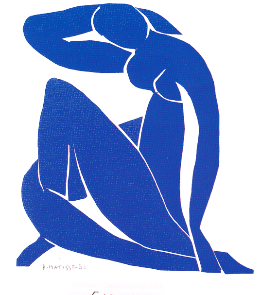
After looking at silhouettes on book covers i decided to look at matisse's cutout collages which contain the simplified shapes i'd like to manipulate in my own design.There is a certain amount of playfulness to his artwork which is elucidated by the random proportions used to generate the figures.
The piece above is very elongated which directs the eye upwards and i really like how outline has been generated by the segmentation of the shapes which elucidates the importance of the white. the curve of the leg is exceptionally disproportionate to the rest of the portrait but it directs the eye round this curve is somewhat mirrored by the arm giving the piece a sense of balance.


http://easybynature.files.wordpress.com/2010/07/icarus-matisse.jpg
'Icarus'- this piece is one of my favourites mostly because i love the primary colours used, the rich blue of the background really contrasts with the golden spiky shapes (possibly supposed to be feathers). again all of the figures appendages are disproportionate which integrates a playful element. i like the roughness to the silhouette which i think it makes the shape more interesting. i plan on using paper to create some of my designs in order to generate a similar effect.  


http://www.thecityreview.com/s02simp1q.gif

the red shape on the chest instantly reminds me of blood splatter which incorporates a real sense of movement and drama. i really like the left hand image, the curve of the back almost contains the figure within a circular shape which is broken by the line of the outer leg. this figure retains a lot of its proportionality in comparison to the right hand one. the separation of letters makes it harder to read the text but the cutout hand drawn style of font correlates with the rest of the piece. i much prefer the blue background in the piece above to this mint green which isn't a bold enough shade to match the boldness of the silhouettes.


Monday 26 November 2012

Femme Fatale Rene Gruau


i knew that i wanted to focus my idea on the femme fatale aspect evident within the novel and i really liked the two female characters that fell strongly within this genre: Vivian and Carmen. because of this i plan to focus on a scene within the book which defines these dangerous, seductive and enticing qualities. before i can begin drawing however i wanted to look up some other representations of what could be considered a femme fatal. Rene Gruau's elegant painted ladies fall directly into this category.

In the painting above it is the portrayal of elegance which most interests me, there is a lot of emphasis placed on line which directs the eye down the frame to the rough edges of the skirt as it fades aways. its strangely fragile which is particularly reminiscent of Carmen's fragile mental state (which is in actuality the cause of all the trouble within the novel). the use of the bold black outline elucidates the soft curves of the figure and makes the character look more dramatic. in my own design i want to incorporate this elegance but i want to also make sure that the gritty genre of the 1930s detective novel is also portrayed which may be achieved through the use of silhouettes or a similar thick outline.


http://fashion.telegraph.co.uk/news-features/TMG8079901/Rene-Gruau-a-new-look-at-the-influential-Dior-illustrator.html


This painting reminds me a lot of Vivian's character and the scene when she is playing roulette: 

"she wore a low cut dress of dull green velvet [...] the crowd closed and hid all but her head [...] i looked at Vivian's face it was taunt, pale, beautiful and wild. her lips were red and harsh".

i think that out of all of the female characters Vivian is by far the most elegant ( possibly because she has the ruthlessness associated with the Sternwoods). i love the lines apparent in the painting above, the smooth curve of the dress  once again draws the eye downwards, the manipulation of the red and black colour scheme generates contrast. red as a colour has connotations of seduction and blood which of course directly embodies the themes within the Big Sleep. the softer smoother textures in the painting simultaneously adds depth and helps to soften the rigid lines of the doorway, an aspect that i shall definitely take into consideration when creating my own design.


http://archdezart.com/2011/12/10/fashion-illustrations-rene-gruau/


This is the Rene Gruau piece that i think most embodies the femme fatal aspect, the red lipstick, the earring, the cigarette and even the shape of the hat as it cuts across the face are all qualities that embody the femme fatal character:

"her black hair was glossy under the robin hood hat"
"she puffed silently with her cigarette and considered me with steady black eyes"
"she was wearing a pair of long jade earrings and nothing else"
"her lips were red and harsh"

i love the how a silhouette has been manipulated to create the face, the white on black instigates drama, the incorporation of the red lips references the film noir genre, whilst the smoke tendril and the matching earring introduce a sense of balance within the print. its very simple but this simplicity retains the elegance of the previous pieces already researched.

http://www.renegruau.com/wp-content/gallery/kiss/cigarette.gif


this is one of my favourites mostly because i really liked the movement of the hair and the rough textural edges, the tendrils remind me a lot of Carmens wild "tawny" hair which is one of her defining characteristics  repeated throughout the book". the peach terracotta colour of the background introduces a warmth which would not have been created if Gruau had used his normal white black red combination.
the flower was another aspect of this piece that drew my attention, in terms of the big sleep i could use a similar face and replace the random flower with an orchid ( another consistent theme). there is a softness to this simple portrait an aspect that i should play around with when designing.


http://www.wornthrough.com/blog/wp-content/uploads/2010/12/Diorling-RenĂ©-Gruau-1963-Private-Collection-©-SARL-RenĂ©-Gruau

Friday 23 November 2012

The use of silhouettes in book covers


after researching some other book covers i noticed that silhouettes were used a lot within the covers that i found effective, since i knew that the cliche detective novels also manipulated silhoettes i wanted to explore this aspect to see if i could generate some effective designs incorporating them.

the font is what attracted me to the cover above, the various angles, colours  and letter sizes make it incredibly playful which contrasts against the  sorrowful pose of the female figure. the shape of the neck looks elegant and is elucidated by the black fill background. the central positioning of the figure and the bright colours used focuses the eye on the title although directionality is introduced via the curve of the shoulder and head. intergrating the text into the design ensures the focal point and adds a point of interest into the silhoette which otherwise would have been blank.

http://lexacatsbookcovers.blogspot.co.uk/2009/12/words-in-silhouette.html


i dont know why but there is something incredibly sinister about this cover ( i think that its just the white eye which looks mishapen within the face- i think its supposed be another face). the continuation of text draws the eye inwards and down the full length of the title, the swirly typography used coincides with the swirls in the hair and make the design look old fashioned which is futher stipulated by the boxed in name at the bottom of frame.

http://www.sewtara.com/wp-content/uploads/littlebee.jpg


cover redesigned by Laura Sharp
this cover is by far my favourite out of all of the silhouette book covers researched, i think its because the stark white background frames the tree which instigates the drama. the red heart at the centre of the tree emphasises the gothic element and matches the red of the title. the spread of the tree across the back cover intergrates a fluidity which stops the segmentation between the back and front cover which allows the whole cover to be seen as one big design. i really want to try and drag my design across the back cover as well in order to create a similar fluidity.
http://laurahsharp.com/?portfolio=edgar-allan-poe-book-cover-redesign


much like the edgar allen poe book above the back and front designs are joined together by the continuous silhouette, however unlike the Poe cover there is still as sense of segmentation because there is a symmetrical aspect. the tree branches direct the eye diagonally across the top of the cover highlighting the title, the font even matches the swirls of the tree. i really like the tree hole in the centre of the spine which makes the spine more interesting without breaking away from the design- having read the book the tree hole is in fact relevent to the story. when designing my cover i really want to make sure i reference the book without being cliche and i definatly want to use some of the subtler themes to achieve this.


http://inkymole.blogspot.co.uk/2010/07/if-i-could-illustrate-any-book-cover.html


This cover is really clever the one section of red instantly provokes focus directing the eye horizontally across the cover. the delicate hints of detail give the two silhoettes a sense of depth whilst the positioning of the figures segment the cover in two, this balance is continued via the birds; i particularily like the reversal of the silhoette apparent on the dress the small points of black which help to create some more interesting shapes. the font choice is elegant and has a 'magical' theme which is obviously congruent with the story. if this book were on a shelf i would definatly pick it up, the use of the silhouettes suggest mysteriousness and it is the level of intricacy which i think makes it incredibly effective as a book cover.
http://littleshelf.blogspot.co.uk/2012/06/stacking-shelves_23.html


this cover has a very victorian steam punk feel to it and it is the busyness of the intricate silhoettes which initially attracted me to this cover. despite the level of intricacy the main silhouette shape is contained by the thick red border which helps to balance the sheer amount of design. there is a sense of symmetry which continues this balance and ensures that the title becomes the main focal point. the red intergrates a warmth but i think that the cover would have worked just as well on black. the swirls contrast against the straight columns which seem to frame the two female figures- this would possibly suggest that containment or imprisonment is a theme within the novel.
the level of detail is more congruent with the victorian era so when designing my cover i shall try to relate to the 1930s/1940s to ensure that my own design relates to the period that the book was written in.
http://katsbookmarked.blogspot.co.uk/2012/04/book-review-somnambulist.html

Thursday 22 November 2012

Modern Book covers


since my book cover would have to appeal to a contemporary audience i decided to research some modern bestselling mystery novels to see how effective and eye catching there covers are i got all but the last book cover from the amazon best sellers list.


this design is incredibly simple, the predominatly black background is dramatic and the lack of motif forces the eye to the text which dominates the cover. although i dont think the font is interesting i do like the  larger spaces between the letters which  somehow seems to enunciate the drama ( again in keeping with the mystery/thriller genre). the colour scheme is once again reminiscient of  film noir something i will definatly take into consideration when designing. the white on the left hand side of the cover intergrates a sense of movement nad divides the frame vertically in two which directs the eye across the cover and along the text.


the colours in this cover are really effective the red instantly focuses the eye drawing the eye outwards from the text along the wavy line of cloth. the cloth provokes a  real sense of movement  intergrating a directionality which is aided by the darkened corners. the blurryness of the male figure  ( works much like a silhoette concealing the features enough to initiate mystery which is congruent with the genre). i think this design is a little too serious to take aspects from for my design but it has confirmed that i would like to introduce an element of playfulness into my own design.


out of all of the modern best sellers this is my least favourite cover- i think its because the title and author name take up too much of the frame. the black on white is boring and although the angle of the panther directs the eye to the title the whote cover looks too empty to be effectivly eyecatching and i definatly think that colour could have made it look more intresting.
http://www.amazon.com/Best-Sellers-Books-Mystery-Thriller-Suspense/zgbs/books/18


i love this cover its probably my favourite so far out of all of the covers researched, it has a very retro feel about it i particularily like the purple tone used which focuses the eye. the text on the back is really unusual and i think that its a very ingenius way of presenting the title. the curved font of this text matches the vibrant tone and has a 60s style.because of the bright tones used the bare background offsets the figure and helps to elucidate the line of the shoulder. i think that this cover contains some clever intergrations ( the text curving round the figure and even the penguin logo in the 007) which i want to try and include in my own  cover.
http://dev.typophile.com/node/53664

after looking at some modern covers i want to look into covers that use silhoettes since i think that using silhoettes is going to fully reference the film noir/ 1940s mystery genre without me having to compromise on the moderninity.


Other Raymond Chandler book covers


after looking at book covers solely for the big sleep i also began researching other chandler book covers (since the same character of phillip marlowe is featured in each of them i figured that their covers would also convey the detective genre that is explored in the big sleep).


i love the font in the cover above its got a very playful element to it, the rough outline almost matches the ruggedness of the main character. simultaneously this cutout look is also stipulated by the jagged edges of the camera silhoette which ensures the overall continuity. the red black and white colour palette is very reminiscient of film noir genre which gives the design a classic feel. again its simplicity is what makes the cover so eyecatching which is something i will consider when designing my own.
http://2.bp.blogspot.com/-rwKR5UQQsOw/Tkeixwd1m9I/AAAAAAAAAa8/F53ko9WEbDM/s1600/KillerintheRain.jpg


this cover has a very hand drawn feel to it which is depicted through the shading and although i think the background is a little fussy i really like the macabre knife and yellow rose emblem which instantly draws focus and obviously symbolizes something within the story. i havent read this story but i know that it features the same detective in the big sleep so i know that it is a mystery novel, suprisingly this isnt conveyed through the cover art which gives the cover an origionality. although i think that this makes the design unusual, in my own design would prefer to reference the detective genre.although the font is very compact the background is too vibrant and overpowering to ensure clarity which is something else that i will consider in my own work.
http://www.raggedclaws.com/home/wp-content/uploads/2012/08/tom-adams_the-little-sister_ny-ballantine-1971_023978095.jpg


the blue of this cover is what initially attracted me to this design the mottled texture provokes contrast against the smooth  lines of the figure. the woman to my mind looks odd ( possibly because the face isnt complete) and the rest of the cover looks too bare in comparasion so i dont think that the cover is effective. i do like the positioning of the text the soft swirls obviously relating to the 'water-lake' aspect. the back also looks too formulaic so i plan to ensure that the back cover to my own design is just as eye catching as the front.

http://www.tumblr.com/tagged/private-eye?before=1305397710
 

The Big Sleep previous covers


i began by researching previous big sleep covers ( not all of them are from the 1930/40s era) but i wanted to see what other people had taken from the book and how they had translated aspects from the book graphically.
 First book cover by Rhys Morgan- graphic designer
The design abover is one of my favourite big sleep covers, i like the containment of the design the framing of the droplet elucidates shape which is futher enhanced by the monochrome colour scheme. the text is very reminicient of the art deco era which emulates the period of the novel. its simiplicity is what makes it visually effective- its uncomplicated and revolves around shape.
http://designatatrium.co.uk/designer_portfolio_project.asp?ID=219&PROJECT_ID=1825


i think that this design as a lot of potential i like the manipulation of silhoettes which once again emphasises shape and although the detective hat gun is a little cliche it is a fun modern interpretation. however i  greatly dislike the typography used which looks too much like bubble writing to be effective  and whilsti do like the clever intergration of the gun within the sleep the text itself does nothing to reference the novel. the black and yellow colour scheme provokes contrast and initiates drama but i dont like the reddish brown used on the back which detracts from the dark block front cover. when i begin designing i plan to introduce some more subtler aspects which reference the book without falling prey to the stereotypes.


the book cover above has a very art deco retro feel about it and i love the angularity present which gives an origionality to the cliche scence of the detective. the two colours keep the design simple and understandable and i really like how jaunty angles have been manipulated on the back to continue the 'square theme'.  the bold but thinner font fully displays the title simultaneously ensuring the designs continuity. however i think it would have been better to create a design that depicted a scene from the book in this style because although the detectives portrayal is unusual and effective the overall design doesnt fully emulate the novel.

http://www.behance.net/gallery/Book-Cover-design-The-Big-Sleep/5440223


This design promotes the femme fatal aspect within the book which hasnt been present in any of the other covers researched. because its a modern representation the shapes are very clean and theres a lot of manipulation of block fill colours which once again introduces a simplicity. the wisps of smoke directs the eye to the title, the font fits perfectly ito the design and the deco feel. the red of the blood is futher stipulated on the author name and contrasts with the blue of the shirt and skin. the blue intergrates a sense of mystery and helps to seperate the foreground figure from the predominatly black background. 
http://dansippleblog.blogspot.co.uk/2012/02/big-sleep.html


out of all of the modern reinterpretations of the book cover this is by far my favourite, the cartoon style of the cover looks dramatic and i really like the textural shading evident within the background which frames the figure. red and greys keep the design simple and and help to segment the cover into 4 sections, the long continuous strip of red offsets the name directing the eye across to the back of the book and the red eyes which reference any one of the femme fatal characters within the novel. the comic book style has given the cliche detective pose an origionality the hand drawn style  references the covers in the 40s whilst the black outline initiates moderninity.

its interesting to see what other people have taken from the big sleep and i want to make sure i avoid the obvious cliches in my own design- i definatly think its key to create a cover based around a certain scene of character to really display what the book is about.


Friday 16 November 2012

The Big Sleep initial themes and thoughts

so far im pretty settled on the big sleep as a book its a lot darker and more intresting than the wind and the willows and i would prefer to work with something thats less familiar in order to generate some more origional ideas.

some of the themes within The Big Sleep which should be considered when designing.

orchids ( seem to appear a lot within the book link to to death/ the cynical endings perspective)

cigerettes- part of the era/social norms smoke in particular might make a good design aspect

Rain- the weather seems to be synonmous with character Marlowes mood throughout the book. perhaps it is also a comment on the society- the city is being drowned in corruption ( corruption of the rich, the poor the police and even the female characters)

blackmail/gambling/ alcohol- emphasises the corrupt 'seedy city'. one of the main sisters Vivian plays roulette which could also make an intresting design.

femme fatal characters- all the women are apparently dangerous within this novel, they all attempt to use their own sexual power to manipulate Marlowe. and whilst Marlowe is attracted to all of them he does not allow himself to be seduced and even attempts to seduce one of the Sternwood sisters for information.

vivian- calculating/ clever and seemingly elegant contrast to carmen

Carmen - animalistic ( could make for some intresting visual aspects) this animilistic quality contained within her movements could symbolize  primal desire which the mystery revolves around, it could also highlight the theme of corruption which is instigated by this human desire. could be caused by drugs its not really clear if she as a character is crazy or if its something else. she also seems to be naked a lot througout the story which again links to her animal nature and the concept of primal desire.

Agnes- silver nails/ tough girl grifter

Silverwig/ Mrs Eddie Mars- curved, beautiful ruthless Marlowe takes a liking to her.

Out of all of the women Carmen appears more within the books and there are far more very striking events pertaining to her that would translate well visually. ( sitting in the chair in nothing but her jade earrings, pushing Brody into her room with a revolver, lying naked predatorially in Marlowes bed etc)

 the police/ the gangsters-  by assosciation guns,footprints and body marks

the car being dragged out of the pier- a chapter in the book which stands out in my head and would make something visually striking (possible backdrop).

chess is referenced once but it relates well to the story as a whole the mystery itself is a clever and brutal game;
"this was not a game for knights" a cynical reference to the morality of various characters. the embodiment of morality marlowe who ironically enough is the only 'knight' within the novel.

poison- the poison of the blood which is elucidated through the Sternwoods, and the literal poison of cyanide which kills of one of the characters.

dead birds- in relation to snitches.

definate theme of madness- most of the women within the story are somewhat crazy and this theme of madness appears to be synonymous with sex ( the concept of human desire being primal and destructive is further stipulated by this).

im not entirely sure what im going to work with but there are a lot of themes within the book and i would like to try and find something that embodies the world of the story without being cliche and unorigional. smaller aspects ( like the orchid or the jade earrings) could be placed on the spine or used without being overpowering.


Monday 12 November 2012

Book Cover Brief


 to create a book cover - to the penguin design award requirements using illustrator, photoshop and in design.
adapt this design to generate an a2 poster advertising the relaunch of the chosen book
produce a written statement 500-1000 words referring to semiotics
we are also required to generate a branding guideline for both the book cover and the poster.

Penguin design award brief: The Big Sleep
 looking for an original striking cover design avoiding obvious cliches to entice a new generation of readers. it will have to contain an imaginative concept and appeal to a contemporary audience of both men and women.

Penguin design award: The wind in the willows
again looking for originality but since the wind and the willows is more well known the key to this book cover design is reinvention to incorporate a contemporary twist to the classic. although the target audience of this book is children it should also appeal to an adult audience.

initially just from reading the briefs i'm drawn to The Big Sleep, i think it will be easier to generate more original ideas and concepts than it will for the wind and the willows and i am immediately smitten with the detective genre.

Friday 9 November 2012

The final

this is my final poster i've moved the black lines round the outside of the art board and i've changed the "f" from the facebook logo to just the facebook f which i think makes it easier to read (i did like the integration of the logo but i didn't think it needed it and the others had trouble understanding it). i did try to move the line of the slogan at the bottom but unfortunately whenever i attempted to change this aspect it affected the other aspects of the design and i didn't think it was really worth the time or the stress since i don't think that its that noticeable. i found an orange circle lining the outer edge so i deleted that which just makes the design a bit cleaner.
the main thing i've learnt about illustrator that i need to employ in future projects is grouping my lines and separating my layers ( it'll mean that i've got more organisation to my objects and it'll be a lot easier when editing). i tried to play to my strengths in illustrator (layering up brush strokes to generate shading and texture) and i feel the techniques i've used are very simple, effective, but ultimately simple because of this next time i use the software i plan on trying to expand the range of tools that i use in order to develop more of an understanding, although since its the first time i've used illustrator i am impressed with what i've created.
Despite these issues, i am really proud of what i have achieved, keeping everything simple and making sure nothing was overpowering was the key to my design and i'm glad i managed it because i think my poster (in accordance to the brief) has successfully combined the facebook aspect with the spanish propaganda posters . i've really enjoyed the project as a whole i especially liked the design process and how my design on paper has translated into illustrator. if i had more time i would like to have created a second poster featuring the same square character, initially i had a lot of design ideas and it would have been nice to explore those as well.

Tuesday 6 November 2012

critique response

The poster above is the poster that i presented for the crit, i got a lot of positive comments and the aspect seemed clear, two changes were suggested;  to make the slogan edge parallel to the block rectangle on the shield and to alter the "f" in the "rifts" so that it was clearer and more readable. i agreed with both points so i definitely want to try and change them on the final poster. altering the f will be easy but i may have some issues trying to make the edge of rifts because i have not been very careful in creating and labelling new layers. thankfully i don't think that this is too much of an issue so if i cant figure out how to change it i'm not worried. i noticed myself that i had a few lines along the very edge of the poster ( when i had to make it a live paint i had to box the edges in order to fill the outer bits) so i also  need to drag these visible lines of to the edge of the art board. despite these small changes im really happy with it - i did ask my peers if anything needed to be done on the buildings but they didn't feel anything needed to be added and i agree i've successfully balanced texture with fill colours so i think anything more would be too overpowering.

Friday 2 November 2012

Little details

i liked the chalk outline so much on the outer circles i wanted to introduce a small amount within my acutal poster i thought the block symbol was ideal since the line is so harsh and needs to be softened so i applied the brush to the shape on a new layer. i think its really effective since it breaks up some of the smooth background texture and simulatneously fattens the line.
because i thought the chalk line was really effective on the main rectangle i wanted to also hint at it in some of the background softening the outer lines of the silhouettes was perfect becuase they were a little too angular and were again basic shapes so i didnt have to worry about intefering with small details.

I also added a chalk low light along the curve of my shield just because it looked a little bare im not entirely sure if its needed though so i might ask my peers for an opinion when i present my poster.
i felt my rays looked bare as well so i introduced some scroll brush stokes along the centre line i didnt want it to be overpowering so i gradually made the stokes smaller. overall it just initiated a touch of texture which i think it needed in order to ensure my posters textural continuity.
id played around with the block symbol and decided to place them in some of the windows just to see how they would look. im still not sure on them but the buildings definatly need something so again i think im going to ask for opinions when i present.
 

Circles round the outer edge

i knew that i wanted to soften the outer edge of my main circle espescially since the design was contained within the white of the page and felt that it would look too bland if i just left it. softening the edges would simultaneously introduce a little texture around the outer edge which would contrast again the fill of the circle.
i created a layer which i placed at the bottom and used the elliptical tool to create two circles slightly larger than the main one. i then applied the chalk brush  to each ( a brush style i really liked and felt would be a bolder dappled texture than previously used) and created a light blue ring and a grey. origionally i had planned to just use grey but i thought that there wasnt enough of the blue tone in the poster which would be an ideal contrast to the thick fill of orange.

rings with basic fill- i think it looks really good - has also reminded me that i need to fill the bottom of the buildings with the darker grey since i think that theres more of a contrast with the darker tone.
 

Thursday 1 November 2012

Altering the background

i felt that there wasnt enough texture in the background so i began to introduce some of the texture that i had in the man along the curves of blue at the back which i felt would help to soften the shape and would be easier to blend since the background colour is a light grey.
it definately needed something and i think this at the very least creates a shadow which emphasises the shape. im trying to be carfeul with how much of the texture i introduce i dont want to overwhelm the poster but i dont want it to be too flat.
i was pondering what else i could place within the background and played around with the block symbol - i felt that the buildings were the weakest point of the design but i couldnt figure out what do with them so i was mostly just experimenting. i came up with an edited block symbol ( it had a chalk outline which gave it a rougher edge and was darker blue) i was thinking about placing it in some of the windows but im not really sure. hopefully inspiration will strike and ill have more of an idea.

Shading the mans face

im happy with the shading on the mans arm and chest but wasnt initially sure how to approach the head, i didnt know whether i should continue the same tonal stuff already experimented on the chest and arm or whether i should fade it out. so i decided to continuethe textural shading ( if i was going to fade it out i'd need to have bits of tone anyway and if it looked good as it was then i would continue it on the rest of the face.)
i made sure that the brushes were small and that i didnt overpower the face with too many unnessecary textural tonal elements. i did in a way fade out this shading since i only defined some of the curves before then manipulating some solid fill.
in order to contrast against the textural white area i introduced some blue fill using a solid brush before softening the edges with the scroll brush. i also applied this same principle with the hair but i gradiented the corners to give it some depth and added some longer light strokes throughout in order to generate some hair strands ( in a basic way i didnt want it to actually look like hair but i thought it would correlate better texturally). so far im really pleased and i now need to find a way of balancing the background in my poster with the foreground man.

Starting to shade the man

After filling all the block colours within my poster i then decided to embark on how to shade my character who as a main focal point was pretty intergral to my design. id roughly planned out how to approach this task within my sketchbook and after some brief experimentation i began by using the paintbrush to fill in some of the solid areas of shade ( i chose a middle grey which made it easier to blend darker or lighter depending on where i started tonally - i also kept the opacity low in order to map out where i wanted the tones to gradient out from).

after this i then chose a basic watercolour brush ( one that didnt contain shading but did depict the soft smooth edges) and slowly added varying stroke to begin generating tone.

i did find that manipulating the same colour and simply altering the opacity of it worked much better when blending the tones together espescailly when creating the base. it allowed me to introduce a sense of light and dark without it getting too complicated and lost in the various colours. it was also particularily useful in terms of the watercolour brush ( since these brushes tended to lighten whatever tone i used anyway it was a lot easier to use black which actually came out mid grey due to the brush style). after using this technique on all my areas of shade i then wanted to incorporate some more defined and textural strokes which i achieved by using a scroll brush.

when using scroll brushes i generally started with a larger stoke ( 3/4) and a fatter brush using the lightest tone of grey and gradually getting darker to generate the tonal gradient. this much like the watercolour brushes created a base from which i could introduce additional details. once this base was finished i used thinner and smaller scroll brushes to blend the tones together starting from the lightest tone to the darkest was more practical because it was easier to layer the tones on the lighter than to try lightening the really dark ones. im actually really pleased with how the shading has turned out ( i was initially worried because its hand drawn). i also found it useful to occasionally introduce occasional strokes of a curved waved ink pen which had enough shape to blend well into the white areas of the man but was solid enough to convey the tone.
i continued this on the arm ( which had a larger gradient of tone that needed to be added so i simply increased the brush size accordingly) and on the rest of the chest.  adding dappled blue stokes to intergrate the blue tone in my design was failry easy and since the colour was so light i generally blended inward using the white scroll pen to texturise the edges of the colour.