Thursday, 31 October 2013
After Effects Overall Opinion
I put all of my compositions together and found that I was 2 seconds out, in order to shave off the extra time I carefully cut it from the opening of the dreaming hamster scene and took some time of the hamster running close up scene. I was worried that it would make my animation too fast but it hasn't affected it too much, having said this I plan on raising this issue during crit. I am also a little worried that I've kept the animation AE side of it too simple - I have literally experimented with the transform tools and the generate stroke effect hopefully this is all ok since I do like the look of my animation and what I've achieved hopefully I can get more opinions on this in crit.
After Effects Continued...5


After Effects Continued... 4
The start of my how to lower your carbon footprint segment was by far the longest and the most complicated. I had about 23 layers to the entire scene with my various vegetables on each, initially it was very simple and I made good use of the parent tool. However it got more complicated when I integrated more movement by adding in a zoom aspect I had to make sure each element the soil, the grass the veg all moved smoothly together (its still not perfect but its mostly there) it also all had to be scaled carefully at the matching keyframes and repositioned so that there was a smoother movement. Im happy with it so far but its not completely correct- although I guess a slight jerkiness matches the visual style of the piece.


After Effects Continued....3


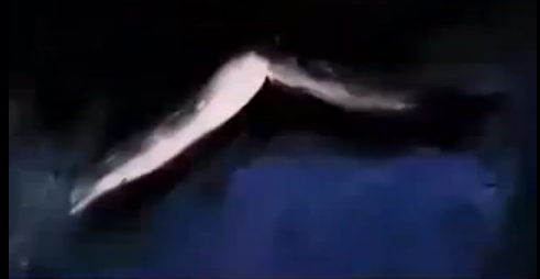
The second scene of my animation, has been cut to from the lights on section so far its the scene that stands out as the most hand drawn, once again the scene is very simple and involves using the hamster running composition (scaled to size) and the lights on composition. A simple rotational movement keeps the wheel turning and I'm hoping the simplicity and blandness of the opening is going to contrast with the second half of my animation- the half that addresses the changes we can make to lower our carbon footprint. The scene after this is a close up version of the hamster running much like in the screen shot above.

The next scene then really begins with my hamster sleeping, again I cut to this shot but I plan on integrating some smoother transitions when the content really gets going. The dream clouds fade in (generated through the use of the opacity tool) and the clouds themselves also move by millimetres which creates the impression that the clouds or even the dream are about to take off which obviously it does. The third cloud below moves from its position and actually forms the basis of the transition into the next scene.

The third cloud moves to the right of frame until it disappears as seen above and then moves from the left side of the next scene and expands, its so far one of the smoothest and once of my favourite transitions, the words then fade into view before the next frame is cut to.

So far I'm really pleased with what I have achieved though so far the dream transition is my favourite, probably cause its smoother and links well something I plan on trying to include throughout the rest of my animation.
After Effects Continued...2


So my opening the light turning on is actually pretty boring to look at- although I've tried to make it more interesting visually I wanted to make it more interesting movement wise! I decided to do this by giving the burst of light a small continuous movement by changing the position of the light by 1mm each time something I plan on using in any of the 'still' scenes. I didn't think this was enough however so I found this great little tutorial on Videocopilot that showed how certain elements could be drawn on and although text is used in his example I translated this movement into my stars to give this opening 2 seconds more of an impact.
The tutorial I used is below:
http://www.videocopilot.net/tutorials/graffiti_writing/
After Effects
So after I made all my assets and exported them as individual pngs (because the files were huge and would have taken ages to load into AE) i finally opened After Affects (AE). Pretty much after that once I got started I decided that I loved AE. I had so much fun making things move (although I'm conscious that lot of my movements are very simple and I've only really used the basic tools in AE so far.) I didnt start with the beginning of my animation- I jumped right in to try and make my hamster move since it was the most complicated element within my animation.
The first tool I tried to use to make my hamster move was the puppet tool, I saved out all the legs as individual images that were separate from the body and had a go at using the Puppet tool to generate the movement.


The first tool I tried to use to make my hamster move was the puppet tool, I saved out all the legs as individual images that were separate from the body and had a go at using the Puppet tool to generate the movement.


However I quickly found that although the puppet tool was really cool it didn't really work very well with my legs- I think because I need to segment the legs even more so the joints were separate images and could move without twisting the image- which kept happening when I pulled the points too far.
As well as this as much as I was willing to try and make this movement work, I suddenly thought that perhaps the movement was too smooth and not in keeping enough with my paper cutout hand-drawn style.


So after deciding not to use the puppet tool I opted to create the hamster movement through the use of 2 images which was my initial plan before going into AE. I added a drop shadow to my hamster scene in AE to try and cement this handmade cutout paper style. This movement was jerky and slow but I think it actually works much better with my visual style. I made the hamster movement into its own composition and then I opted to start my project from the beginning scenes.
Tuesday, 22 October 2013
General Style- Illustrator Scenes
Since Illustrator files are compatible with After Effects I have placed all of my drawing and characters in there respective scenes which are dictated through my story board. Placing different characters and objects on different layers so I can add motion to the specific layer that needs it.


My hamster is probably going to be the most difficult to animate and i plan on switching between two leg movements and using a slow rotation on the wheel to create a jaunty playful motion that I think will match the style more so than a faster smoother movement.


I really like the contrast of my brown paper background and I'm really pleased with my visual style, although based very much on Sala's work I think I've managed to make it my own through colour and texture.
Backgrounds
Since I have a lot of hand-drawn elements I thought that it would be too overwhelming to also have hand-drawn backgrounds so after looking at the Paper Planes video again I thought that a crumpled paper background would work really well in offsetting my characters. My colour palette was very much inspired by Wallis' work and I kept to darker shades of colour.


The Hamster


I created my hamster first using Illustrator, I used several chalk effect brushes and a range of brown shades to generate his character. I tried to make him look rough but not overly messy and I think I've succeeded, initially I thought the outline was too much but actually I think it works with the hand-drawn style since it reminds me of charcoal. I think my hamster looks very cute which is helped by the dot eyes (originally I was going to draw an exaggerated human style eye, but thought better of it when I realised that hamsters had beady eyes). Ive also created two different leg movements (the positions of which I simple swapped over, so the background legs are now in the foreground positions and vice versa) and plan on switching between the two to create a jaunty playful movement.
Monday, 21 October 2013
Alfred Wallis- Visual Style Artist
Although I have a very clear visual style in mind, one that is heavily influenced by Felicita Sala, after my pitch it was suggested that I look into Alfred Wallis. I actually really liked the style of drawing, although I think that Wallis' visuality has already been translated into my work, through the use of black outline and rough brush strokes. Despite this I really love the textuality to much of Wallis' work and I definately want to incorporate this textuality to provide some sort of seperation between background and foreground.

 Whilst the painting's themselves were created in the 1900's this concept of flat/ 3d is actually an aspect which looks surprisingly modern fully highlighted in the painting above. I really like how the expanse of textural blue is broken up by the introduction of fine details, details that look almost cartoony and printed to my mind. Shape is obviously a key aspect within his work and this is merged well with texture to generate a more interesting scene. The colours are beautiful and I think I'm planning on using a similar colour palette, I'm going to stick to dark tones, of blue brown and beige and then periodically highlight these aspects with brighter blues browns and oranges. The sea is what draws my eye in the painting above and there is a great deal of blending to the colours which helps to generate a very vivid patch of water which is only broken through contrastingly black and yellow segments.
 The painting above is my favourite out of the Wallis work that I have researched, I actually really like how dark it is and there is a great deal of contrast generated through the use of colour. Again these colours are going to be evident within my own colour palette. The background is incredibly textural and it really frames the main boat in the centre which is comparatively smoother and brighter in appearance. Theres a dusky element that I really like and one that I plan on incorporating though various brushes in Illustrator.
 The painting above is perhaps too childlike to my taste, the shapes seem to simple the colours unlike in his other works too flat and the texture is somewhat lacking. However I do appreciate the contrast generated through the black outline which is why my visual style will incorporate this outline.


Pitch and Animatic
This is the animatic that I pitched on Monday, Strangely it took more time than I would have thought it would have to make my animatic but that was mostly due to music issues. I started off with the ELO's Mr Blue Sky but didnt think it matched the images well enough so I decided to then try out some of my other musical considerations (Bob Marley, Queen and Mark Ronson) however it was only when i realised that I should lengthen some of my frames that I realised the ELO's Mr Blue Sky worked perfectly. No-one seemed to have any problems with my idea, text or visual style although it was recommended that I make it seem like the hamster is dreaming the resulting 'sensible energy considerations' sequence which I agree with since it will help to instigate more of a link between the hamster and renewable energy sources.
Storyboard

This is my storyboard for my final idea. My idea really began and developed from this concept of a hamster running in a wheel and being able to power a house, which was pretty much an original thought although it was inspired by the hamster power stickers researched very early on in the project. Most of my movement will be rotational spinning turbines, wheels, and hamsters will generate most of the movement within my animation. Because I started with this idea of hamster power I opted to start my animation with this movement and then display some more sensible methods of reducing the carbon footprint. I was initially a little worried that including this hamster element would be a little too random but I decided that it actually helped to initiate one of the animation principles: humour. Since I liked the hamster element and the humour it integrated I continued to develop the idea regardless. I had already established that renewable energy was going to be one of my themes since it has a big impact on the carbon footprint and I also included a small grow your own veg section because it helped to transition between the hamster and renewable energy, but also because I wanted to portray two extremes - big ways on reducing our emissions and small ways. I plan on using a lot of rotational movements to transition between scenes and the hamster will also make an appearance at the end of the animation to make it seem as though the hamster has come full circle. A small amount of text will be used to really cement the themes within my animation which will also help to reinforce my concept. Overall so far really pleased with the idea and I have a fairly good idea of my visual style.
Sunday, 13 October 2013
Final Music Choice...
After creating my animatic and going through all of my music options listed in my research I finally settled on the opening 28 seconds of the Electric Light Orchestras Mr Blue Sky, I had issues with Mark Ronson's Inversion because it was too fast, I wasn't entirely convinced by Queen's a crazy little thing called love, although I love the song and it had great bounce I think it was also a little too fast and not quiet right for my visuals.
It ended up being between Bob Marley's Don't Worry be Happy and ELO's Mr Blue Sky and in the end I decided that the whistling opening of Bob Marley's Don't Worry be happy was actually too slow and not as upbeat as I would have liked. I wanted something fun, bouncy and consistently fast paced. Initially I had tried the Mr Blue Sky song and I didn't think it worked but after a good look at my frames and lengthening them so that the visuals were clear I found that it did work especially when I incorporated the light switch sound effect which helped to give my animation more of an opening.
Felicita Sala Artist Visual Style...
Because i've finally clarified my visual style I decided that I should the Illustrator responsible for generating the artwork used in the Paper Planes animation from which I am basing my style.

http://littlecommas.files.wordpress.com/2012/08/opeople.jpg

Because I plan on drawing animals I looked into a lot od her animal drawings. Although Sala uses watercolours I think that I can recreate this effect in Illustrator. I love the simple shapes that have been used to create the animal, the textural elements and the complexity is introduced via the scratchy strokes which create points of detail. There is a lot of fun and I would consider this a more sophisticated style of cartoon that would definately soon my needs.
http://media-cache-ak0.pinimg.com/236x/83/ae/af/83aeaf85e1580a8fab2a3b2435361457.jpg

Since I will be drawing bits of veg I looked into some of her work related to ingredients. The colours used were vibrant and there is a slight elongation to the watering can which if used could refer back to the animation principle exaggeration. I also really like the typography on this piece which has a quirky feel which once again related to the overall poster.
http://a1.s6img.com/cdn/0007/p/1334201_14909272_lz.jpg

I loved the colours evident on the birds again something to consider- I originally planned to use browns and deep colours but the pastel vibrancy of the birds are highly striking. I love how the detailing uses simple lines and shape to create the impression of feathers. This is something I certainly plan on employing when drawing my hamster- i'd originally planned on using simple lines but I think i may now also include some select shapes too!
http://media-cache-ec0.pinimg.com/236x/31/8a/14/318a146d99cf216ce099ca4f8668922b.jpg
Visual Style considerations
I generally preferred the more arty and hand-drawn styles of animation because they felt more organic. As well as this since I consider drawing a strength it would make more sense for me to incorporate a style into my animation that plays to this strength. Having said this during my research I found a great many of animations that generated various hand-drawn effects very differently.


I really liked the paint like style employed in this animation, its very abstract, very bold and has a great hand drawn organic feel to it. I think its the roughness that I really like the most and its textures which integrates a playful element that concurs with the hand-drawn style. Theres a mix of paint, pencil and textures and most of the various strokes/shapes move in simple ways with the music up down, and backwards in general although there is a sense of zooming which integrates depth. Fast cuts match the beat of the music and the images are in their own loops which keeps the images continues much like the music. Both colour and Black and white have been used which helps to emphasise the instrumental chorus section. There are no discernible characters but from what I can tell the animation relies on its fluidity.


Scott Free productions manipulates similar paint strokes to generate its logo and again I really like the roughness of it, a roughness that I plan on incorporating into my own work, the colours are deep and placed onto the background in simple block which contrasted against the white of the character. The movement is fluid and each stroke morphs into another aspect which is helped by the roughness of style. I like how even the still parts look like they are moving because the lines move in each frame by a few milametres which makes it look like its in constant movement. I also really like the jaunty type which is something I certainly plan on including in my own project.
http://www.youtube.com/watch?v=TJFIXvz9XtE


This sumo animation was very humorous to watch and I really like the pencil style to it its basic striking and integrates the type well into frame. Each movement of the wrestler has been carefully planned and the storyline is understandable and funny. I do really like this style but I want to include some colour into my animation to highlight certain aspects. I also think that if I were to do this pencil line style my drawings would have to be very clean and sharp which would take away from the textural aspect I want to include.

Although I looked into the Paper Planes style as a part of my initial research, I found a few other colour pencil paper examples that I found very striking. Despite this my favourite animation was the Paper Planes one and I am enamoured with its quirky playful style and I really want to replicate this in my own work- although of course mine will include my own artistic style to it. Using crumpled paper as a background allows solid colours to be integrated without the focus being pulled away from the main elements. I also wanted to include little shadows around my characters to really give it a raised feel much like the video. I can give the animation more of a textural aspect through brushes in illustrator and through my text. I plan on using soft colours for the backgrounds set outside and very dark ones for those inside to really provoke contrast.
Subscribe to:
Posts (Atom)