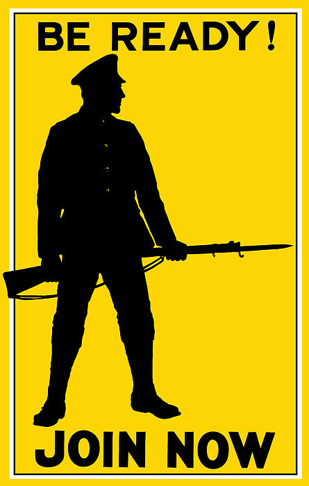
This was one of the first WW1 posters that caught my eye. I
particularly liked the use of the silhouette which looks exceptionally striking
against the gold/yellow background. The faceless man could be any man, which
from a design perspective ensures a wide target audience and is congruent with
the posters purpose. Since the poster has been created to persuade men to
enlist the faceless man represents every man in turn making it more relatable.
The gold background itself has connotations of glory whilst the horizontal
position of the gun segments the frame creating a sense of symmetry (possibly
suggesting that the army itself is balanced). The thick font and the simplicity
of the phrase cements the command (something to consider in my own design).

This poster is at lot more engaging than the first, although again the concealment of the face creates the broader audience and again is aimed at influencing society. There is a sense viciousness that is not evident within the other it appears that the glory of war (which was implied in the previous poster by the gold background and the strong man) has faded. The posters purpose is no longer recruitment. It is instead being aimed at society back home to ensure the continuation of rationing and luxury sacrifice. The comic book stylisation; the bold outlines and shading is visually striking and it again places emphasis on colour. Yellow seems to be very popular within British and American propaganda whilst red appears more within Russian (communist red). The italic knew essentially grounds the poster within reality, horror is being manipulated to ensure the public continue their efforts on the homefront.
Poster Produced by Winchester
NARA Still Picture Branch
http://www.propagandaposters.us/sacrific.jpg
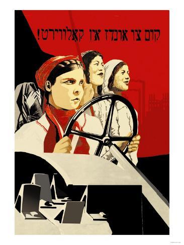 "Drive to the collective farm"
This so far is one of my favourite propaganda posters- its a russian poster and is enforcing collectivisation which occured throughout the 20s and 30s, a process which consolidated individual farms to increase food supply. Mostly I just love the contrast evident within the poster, the black on red is exceptionally striking framing the faces whilst keeping the overall design fairly simple ( too much colour would detract from the message) . The target audience is obviously women again those that would be left behind, and whilst the faces are visible there arent any defining features which keeps the message broad. The use of curve and shape segments the poster diagonally into two halves directing the eye diagonally up the poster to the heading.
http://www.posterpal.com/_images/z230724.jpg

Since i liked the red and black colour scheme in the russian propaganda poster, i decided to try and find more propaganda posters that featured the same colours. This is a spanish propaganda poster created during the civil war (30s) to make men join the labour force. again the poster features a diagonal segmentation directing the eye to the slogan, the slanted positioning of the text combined with the angular depiction of the man gives the poster a very geometric feel. the harsh angles possibly mirror the severity of the war whilst simoultaneously creating contrast which is also exemplified by the manipulation of colour. The grey tones helps to incorporate a gradient which initiates a sense of light and dark and theres a hint of shadow which contradicts the flat angularity of the design. shape is something that i think will play heavily within my own design since its exceptionally effective in providing both direction and contrast.
http://www.spanishcivilwarposters.com/

i couldnt find much information on this poster but i liked the use of colour- and how 3 colours have been used to generate contrast. Much like the three previous posters i have analysed, it is its simplicity that makes it effective. i think its warning of the dangers of chemical warfare (im extrapilating from the gasmask).whereas the last poster that i looked at manipulated square lines this seems to revolve around softer curved shapes, theres also more of a gradient which helps to fade the bold emblems into the base background colour. the use of this gradient also introduces a 3dimensional quality particularly around the head and the gasmask. the yellow contrasts against the blue which helps to initiate highlights and shine, theres even a grainy aspect which softens the edges. diagonal segmentation has also been manipulated ( a common theme which should be considered when designing) which once again focuses the eye on the logo and the text.
http://www.allposters.co.uk/-sp/Italian-Fascism-Posters_i8178657_.htm
so far im leaning more towards the spanish propaganda and think that i will begin my further research more into that area.
http://www.propagandaposters.us/sacrific.jpg
 "Drive to the collective farm"
This so far is one of my favourite propaganda posters- its a russian poster and is enforcing collectivisation which occured throughout the 20s and 30s, a process which consolidated individual farms to increase food supply. Mostly I just love the contrast evident within the poster, the black on red is exceptionally striking framing the faces whilst keeping the overall design fairly simple ( too much colour would detract from the message) . The target audience is obviously women again those that would be left behind, and whilst the faces are visible there arent any defining features which keeps the message broad. The use of curve and shape segments the poster diagonally into two halves directing the eye diagonally up the poster to the heading.
http://www.posterpal.com/_images/z230724.jpg
Since i liked the red and black colour scheme in the russian propaganda poster, i decided to try and find more propaganda posters that featured the same colours. This is a spanish propaganda poster created during the civil war (30s) to make men join the labour force. again the poster features a diagonal segmentation directing the eye to the slogan, the slanted positioning of the text combined with the angular depiction of the man gives the poster a very geometric feel. the harsh angles possibly mirror the severity of the war whilst simoultaneously creating contrast which is also exemplified by the manipulation of colour. The grey tones helps to incorporate a gradient which initiates a sense of light and dark and theres a hint of shadow which contradicts the flat angularity of the design. shape is something that i think will play heavily within my own design since its exceptionally effective in providing both direction and contrast.
http://www.spanishcivilwarposters.com/
i couldnt find much information on this poster but i liked the use of colour- and how 3 colours have been used to generate contrast. Much like the three previous posters i have analysed, it is its simplicity that makes it effective. i think its warning of the dangers of chemical warfare (im extrapilating from the gasmask).whereas the last poster that i looked at manipulated square lines this seems to revolve around softer curved shapes, theres also more of a gradient which helps to fade the bold emblems into the base background colour. the use of this gradient also introduces a 3dimensional quality particularly around the head and the gasmask. the yellow contrasts against the blue which helps to initiate highlights and shine, theres even a grainy aspect which softens the edges. diagonal segmentation has also been manipulated ( a common theme which should be considered when designing) which once again focuses the eye on the logo and the text.
http://www.allposters.co.uk/-sp/Italian-Fascism-Posters_i8178657_.htm
so far im leaning more towards the spanish propaganda and think that i will begin my further research more into that area.
No comments:
Post a Comment