
after researching some other book covers i noticed that silhouettes were used a lot within the covers that i found effective, since i knew that the cliche detective novels also manipulated silhoettes i wanted to explore this aspect to see if i could generate some effective designs incorporating them.
the font is what attracted me to the cover above, the various angles, colours and letter sizes make it incredibly playful which contrasts against the sorrowful pose of the female figure. the shape of the neck looks elegant and is elucidated by the black fill background. the central positioning of the figure and the bright colours used focuses the eye on the title although directionality is introduced via the curve of the shoulder and head. intergrating the text into the design ensures the focal point and adds a point of interest into the silhoette which otherwise would have been blank.
http://lexacatsbookcovers.blogspot.co.uk/2009/12/words-in-silhouette.html

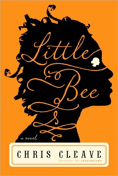
i dont know why but there is something incredibly sinister about this cover ( i think that its just the white eye which looks mishapen within the face- i think its supposed be another face). the continuation of text draws the eye inwards and down the full length of the title, the swirly typography used coincides with the swirls in the hair and make the design look old fashioned which is futher stipulated by the boxed in name at the bottom of frame.
http://www.sewtara.com/wp-content/uploads/littlebee.jpg

cover redesigned by Laura Sharp
this cover is by far my favourite out of all of the silhouette book covers researched, i think its because the stark white background frames the tree which instigates the drama. the red heart at the centre of the tree emphasises the gothic element and matches the red of the title. the spread of the tree across the back cover intergrates a fluidity which stops the segmentation between the back and front cover which allows the whole cover to be seen as one big design. i really want to try and drag my design across the back cover as well in order to create a similar fluidity. http://laurahsharp.com/?portfolio=edgar-allan-poe-book-cover-redesign

much like the edgar allen poe book above the back and front designs are joined together by the continuous silhouette, however unlike the Poe cover there is still as sense of segmentation because there is a symmetrical aspect. the tree branches direct the eye diagonally across the top of the cover highlighting the title, the font even matches the swirls of the tree. i really like the tree hole in the centre of the spine which makes the spine more interesting without breaking away from the design- having read the book the tree hole is in fact relevent to the story. when designing my cover i really want to make sure i reference the book without being cliche and i definatly want to use some of the subtler themes to achieve this.
http://inkymole.blogspot.co.uk/2010/07/if-i-could-illustrate-any-book-cover.html

This cover is really clever the one section of red instantly provokes focus directing the eye horizontally across the cover. the delicate hints of detail give the two silhoettes a sense of depth whilst the positioning of the figures segment the cover in two, this balance is continued via the birds; i particularily like the reversal of the silhoette apparent on the dress the small points of black which help to create some more interesting shapes. the font choice is elegant and has a 'magical' theme which is obviously congruent with the story. if this book were on a shelf i would definatly pick it up, the use of the silhouettes suggest mysteriousness and it is the level of intricacy which i think makes it incredibly effective as a book cover.
http://littleshelf.blogspot.co.uk/2012/06/stacking-shelves_23.html

this cover has a very victorian steam punk feel to it and it is the busyness of the intricate silhoettes which initially attracted me to this cover. despite the level of intricacy the main silhouette shape is contained by the thick red border which helps to balance the sheer amount of design. there is a sense of symmetry which continues this balance and ensures that the title becomes the main focal point. the red intergrates a warmth but i think that the cover would have worked just as well on black. the swirls contrast against the straight columns which seem to frame the two female figures- this would possibly suggest that containment or imprisonment is a theme within the novel.
the level of detail is more congruent with the victorian era so when designing my cover i shall try to relate to the 1930s/1940s to ensure that my own design relates to the period that the book was written in.
http://katsbookmarked.blogspot.co.uk/2012/04/book-review-somnambulist.html
No comments:
Post a Comment