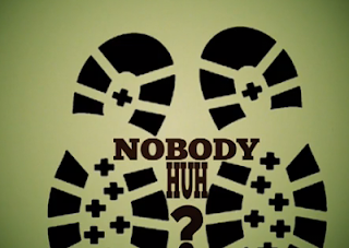
There is a strong element of kinetic text within the project, i wanted to research basic kinetic text before applying any to my video just to see how it could work and emulate the key themes within my trailer.
http://www.youtube.com/watch?v=6mnvvVi4HaI
in the screen shots above i mostly liked the playfulness of the movement itself which kept the text continuous and fastpaced, the colours used ensure contrast whilst the different surfaces and angles give the text a 3 dimensionality probably achieved through the use of motion cameras ( im not entirely sure if i want to use motion cameras or not since my own trailer has a vintage roughness to it that the smooth motions of the cameras do not fit into. the font itself is legible and bold but i think i may design my own font to emulate the britishness of my trailer. id also prefer my own text to have more purpose or subtlety if you will i want it to work with whatever background i place it on and move almost in relation to that, another aspect to consider.
http://www.youtube.com/watch?v=n9WeNXlA3Ek
the kinetic typography movie above was again very fun but again i felt that it was too clunky and would be dominating in conjunction with filmed aspects, despite this i liked how various outside shapes have been included and moulded around the text which is an aspect i plan to consider to ensure my text is congruent with my overall theme.


No comments:
Post a Comment