The first app that I found was a cocktail one, it was mainly informative, but it also had a game section. The styling of the app is seemingly sophisticated suggested through the clean colour palette and the simple shapes. The app allows you to look into cocktails based off your favourite drinks that you input. It also has a small recipe section in which theres is a game element, where you have to mix the cocktail together out of the given ingredients. Whilst this visually represents the ingredients it is very simple and and feels too fun to match the rest of the app. Patches of colour help to define the different types of cocktail and initiate a vivid element in an app that is primarily black and white. The interface is simple, with the various page icons occupying the bottom of the frame, whilst the logo remains cemented top centre throughout most of the pages, although sometimes it varies in size. Because there isn't a specific brand displayed the app feels too impersonal the styling comes across too plain to convey any sense of fun or interest.
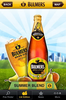
The Bulmers app was one of my favourites, its bright fun and it definitely emulates the Bulmers brand. The yellow backgrounds initiates a vibrancy that also correlates to the original flavour. Although the solid background is only used on the end page and in one of the photogames. The app itself consists of a cider finder and a picture game where you can force pictures into a Bulmers bottle shape. There was also a prize up for grabs for the best bottle photograph. This photograph could then be tagged. I don't really like the game since it seems pointless despite the prize incentive but I do really like the styling of the app. The homepage is one of my favourites and I really like the background sky stripes and the white edges around the shapes, its reminds me a bit of pop art just through its colour use and outline. The white outline helps to separate the brand from the background and gives it a younger feel (Bulmers is aimed at 20s-35s) and this is distinctly conveyed. There is also a sense of the country and a sense of nature which is fully suggested by the vines, clouds and greenery that are present within certain pages. Again the interface is simple the middle section of frame consists solely of the brand itself, with the other page icons situated at the bottom of frame. This is continued throughout although a top bar with a back page and a direct link to the home page has been added for easy navigation.
The Stella Artois 9 step app is actually a really fun game that is simultaneously informative, it visually displays the steps in pouring the perfect stella. Rinsing the glass, Pouring the beer at the perfect angle, cutting off the foam, swirling the beer are all stages within the game. Although the styling is very muted it does match the branding of the beer and the graphics themselves look like a simple smooth cartoon which also coincides with the brand. Simple motions, swipes, shakes and taps dominate the entire game which I think makes the app more fun because its easy to do on all platforms (something that I have to consider because i'm designing for both Ipad and Iphone.) The interface is equally simple it has a next and a back to home button which situate at the top of the frame. There's also sound effects which help to distinguish the variation of movements and an instruction setting that allows you to go through the game step by step.
All of the Apps I've looked at so far have been portrait setting on both the Iphone and Ipad.


No comments:
Post a Comment