
1936- united socialist party
The use of block colour and silhouette places a lot of emphasis on shape- the curve of the fist directs the eye upwards, the filled brown shadowed by the thick black edge generates both shadow and outline. the blurred edge of the white which surrounds the central figure gives the poster a cut out element which also outlines the main figure simultaneously the harsh contours of the face. the use of the left fist relates to political position this is a socialist poster ( so its promoting the freedom of the people who are represented through the faceless man). Again the bold lines and angularity can be translated into my own design - the raised fist could contain the block symbol ( the aspect of web 2 i'm currently toying with) and i could even place the Facebook logo in the background like a flag.
http://media.iwm.org.uk/iwm/mediaLib//192/media-192897/mid.jpg

1936
It is the repetition in this poster which i think is particularly eye catching the straight square faces introduce directionality forcing the eye diagonally down the frame, and there is a clear sense of balance to the image; the square of text is balanced by the five planes in the top corner, even the four figures segment the poster fairly equally in half. again the same brown colouring has been used as in the other ( as its part of a series this brown cements the continuity which in turn cements message). there is a sense of light and dark which is again stipulated by the black outline though unlike the other this poster lacks the soft gradient which keeps this poster exceptionally sharp and clean. personally i think another colour would have been more striking as it would have provided more of a contrast but i still think this poster is visually effective.
http://media.iwm.org.uk/iwm/mediaLib//192/media-192836/mid.jpg

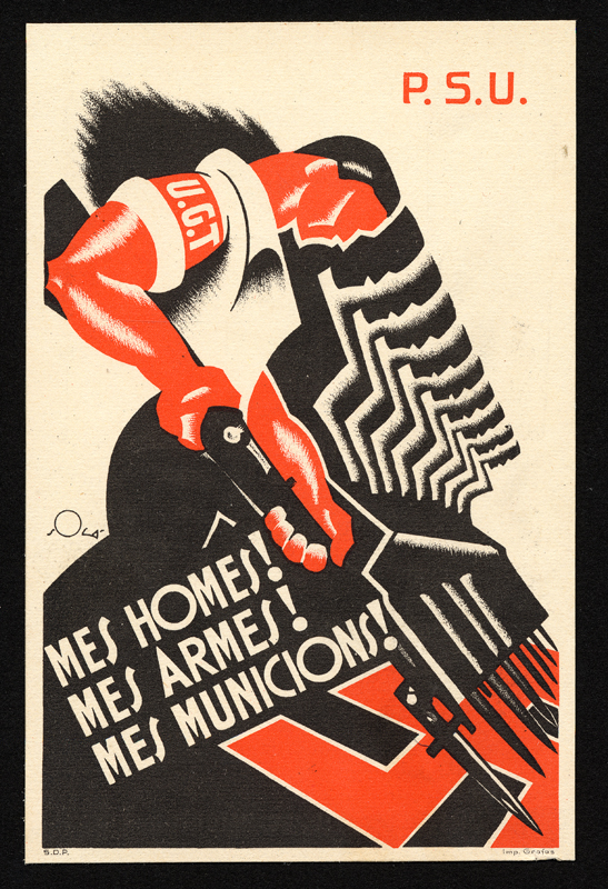
i think this is one of my favourite Lorenzo images because i love the stylistic silhouettes that help to frame the first figure. theres an almost hand drawn effect introduced through the gradient which softens the angular faces and incorporates a sense of movement. its clearly very much against Germany which places the poster again within the socialist party the blocks of black and red are framed with white which helps to emphasise shape. and i really like the blurred smudge in the top left corner which looks comparatively empty highlighting the P.S.U logo.
http://libimages.wolfsonian.org/XB1994.189.8.000.jpg
No comments:
Post a Comment