
After looking at some general propaganda posters from the specified period, i found that the most intresting posters and the ones that i thought were more effective were the spanish propaganda posters so i decided to do some further research into this area ( i created a mood board of spanish propaganda posters in my sketchbook) and before finding specific artists i wanted to explore some general posters to investigate the various styles before focusing on certain artists.
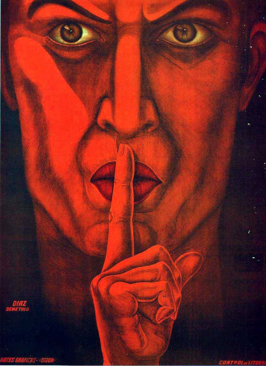
The poster above is very striking, the whole poster is filled with the portrait, the severe expression is very dominating ( a keep quiet spies poster perhaps i couldnt find a great deal on it) and i thought it related to the aspect of web 2 that ive decided to focus on (the block button on facebook) i could replace the finger with the block symbol and place my slogan at the bottom of frame possibly using shades of blue to reference Facebooks logo. orange and red however seem to be used througout spanish propaganda ( the flag colours) so in order to remain as close to the propaganda posters as i can then it may be an idea to use similar colour schemes.
http://24.media.tumblr.com/tumblr_m64dtv7ZBp1rubozqo1_1280.jpg
http://si.wsj.net/public/resources/images/OB-SP029_spain_DV_20120413170305.jpg

"in spain it is dawning, arise spain- supporting the far right movement"
the repetative silhouettes are the first aspects that draws my eye, the faceless figures represent a large part of sociey and the raised right hand indicates political positioning ( republican). the use of three tones keeps the poster very simple which effectively ensures an understandable meaing. again reddish orange in the background refers to the spanish flag. the emblem in the centre combined with the raised hands directs the eye up to the top heading- in terms of my design i could replace that central symbol with the block symbol, place my slogan in the four lines surrounding it and i could even place the facebook logo onto of the faces to instantly place the characters within that site.

http://www.referenced.co.uk/propaganda-posters-from-the-spanish-civil-war/

1937
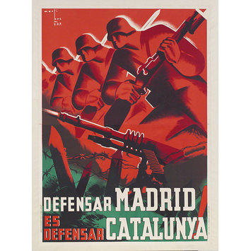
the contrasting colours are the dominant element within this poster the red is vibrant and combined with the armed defense has connatations of violence. again the faces are very square and stylised (which i definitly plan on using within my own design) the repeat of which directs the eye diagonally along the line. i think the message of the poster is depicting the defense of madrid which is congruent with this line of soldiers and the barbed wire.
http://media.vam.ac.uk/media/thira/collection_images/2006BB/2006BB5444_jpg_ds.jpg

1977 (republican poster)
http://si.wsj.net/public/resources/images/OB-SP030_spain_DV_20120413170431.jpg
Although this poster isn't within the 1900-1950 era i liked the face and the closed lips and instantly began thinking of my block aspect. i could replace the cross with the block symbol - use orange over the face to relate to the 1930 spanish propaganda and i could put the facebook logo in the background. the angularity of the portrait is very reminicient of the propaganda ive been looking at so i think the poster emmulates the 1930s propaganda enough to be refered to when im designing. again its the posers simplicity which draws me in ( i can understand its message even though i cant read the writing) which i think is an essential aspect of propaganda posters.
No comments:
Post a Comment