
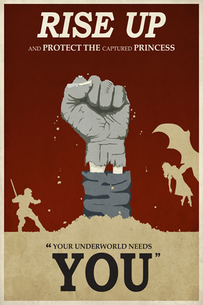
There is a very distinctive medieval theme in this poster from the heroic knight and evil winged dragon right down to the swooning damsel in distress all of which elucidate the fantasy element. the poster is a fun representation of the classic battle between good verses evil which is a well known and understandable concept. Even the central positioning of the closed fist divides the frame in two highlighting the good Vs evil theme. the solid red background frames the grey hand and yellowish silhouette; silhouettes seem to be an exceptionally common theme within propaganda posters they ensure a broad target audience and clarify the overall message because the concept or message has not been convoluted by excessive detail. the bold phrase "rise up"and the one word "you" successfully conveys overall message whilst the capital "protect the[...]princess"emphasises the objective. the closed fist is an emblem that i found within an American ww1 propaganda poster and i love how its been modernised and adapted to fit this promotional game poster something i will consider when designing my own poster- using iconic or well known emblems and adjusting them can be incredibly effective in modernizing the propaganda style.
http://www.ww1propaganda.com/sites/default/files/3g03349u-1591.jpg?1311563397
http://24.media.tumblr.com/tumblr_m8zffxJ1P71rn4obco5_500.jpg

I love the fantasy element within this poster (the flying ostriches and the medieval armour) are incredibly fun and light. My eye is instantly drawn to the stripes which direct the eye outwards from the Knight to the heading whilst simultaneously creating an interesting backdrop which contrasts with the red ostrich.
The poster itself is reminiscent of the world war 1 enlist propaganda posters- yellow (a popular colour used in the posters generated in ww1) again instigates a sense of glory and nobility which is further stipulated by the knight character. The block colours are only broken up by solid sections of slightly lighter tones which gives the poster a cartoony style which coincides with the fantastical theme. the exclamation mark after the 'enlist now!" softens the command, its friendlier than the directives in the previous posters researched and manipulates humour to inspire action rather than horror.
http://brian.carnell.com/wp-content/uploads/2011/01/joust-propaganda-poster.jpg

although i plan on basing my own designs on spanish and russian propaganda style posters i love the fun fanstasy elements within Thomas work and his modern interpretations of propaganda posters.
http://www.acustomposter.com/wp-content/uploads/2012/09/rivendell_final_small.jpeg
Fun examples of a new take on propaganda poster styles. KW
ReplyDelete