
1937 communist poster
My favourite aspect of this poster is the silhouettes at the bottom, the hands and hooks initiate an intricacy which breaks up the black line. the purple softens the outer edge emphasising the hooks whilst contrasting against the brown gradient. the red hat is the central shape which draws the eye inwards the flags all provoke a sense of movement and effectively fill most of the top half which keeps the socialist message clear and understandable. as a whole the poster isn't one of my favourites but i think it works in conveying the working force and i do like the vibrancy of the colours used.
http://farm8.staticflickr.com/7056/6947557235_067451c980_z.jpg

1937
This is one of my favourite Bardasano posters - i love the complimentary greens which elucidate the shapes of the soldiers and contrast with the black print at the bottom. the poster seems to be divided into layers the light green background creates the base, the darker soldiers fill the frame centrally and provides focus whilst the black silhouettes at the bottom instigate balance. there is a sense of repetition through the soldiers which initiates a directionality and theres a softness to the lines and shapes which i haven't really seen in previous posters. i prefer the angular designs just because they have a higher contrast and look more striking which i think is very important in conveying message. im not sure whether i could use aspects of this design for my own ( possibly the silhouettes at the bottom) simply because i plan on placing a lot of emphasis on shape ( to fully establish my block aspect) the poster above revolves the fighting force rather than anything symbolic.
http://lh6.ggpht.com/-sT5Hv4E60m4/UAu1LmEMTII/AAAAAAABzac/7Od9k6uq-XM/Jose%252520Bardasano.%252520Communist%252520Propaganda.%2525201937_B.jpg

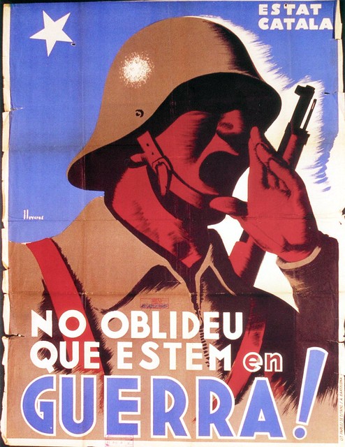
it seems to be very common in Bardasano's work to manipulate the line of silhouettes along the bottom of the frame- they create a simple background which simultaneously frames the design again incorporating balance. the bright red is clearly a reference to the communist or socialist party which portrays meaning and i love the sense of light and dark which is particularly evident on the hand and incorporates a sense of depth. the gradient at the end of the arm instigates movement directing the eye up to the figures who occupy the centre of the design. the background is segmented in two and dominated by white which generates an effective backdrop without interfering with the main design.
http://lh4.ggpht.com/-j7dsYa-kfGM/UAuzq30t8UI/AAAAAAABzaM/EUoaNOIQuF4/Jose%252520Bardasano.%252520Communist%252520Propaganda.%2525201937.jpg

i think this design has the most potential in regards to my design ( my slogan loose lips create rifts so block people you don't like) would work against the open mouth ( lips and rifts). the brush strokes soften the colours used integrating texture but the manipulation of the block colours keeps the overall design very simple. the solid colours are bright and loud which is congruent with the message and the open mouthed figure.
http://farm8.staticflickr.com/7176/6947553781_48105be4e3_z.jpg
No comments:
Post a Comment