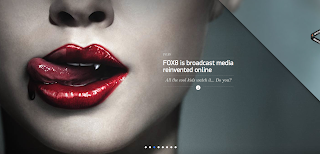
i mostly really like the simplicity of this site its a simple scroll along site- the navigation is placed centrally within the frame allowing the sharp photographs on each to dominant. there is a great amount of contrast in colour which helps to keep the text clear and understandable. and even on the home page the central positioning of the navigation ensures the overall accessibility as well as generating a clear organised structure.
http://www.deepend.com.au
http://50problems50days.com/problem?day-22-forgotten-stories&back=%2F
the site above is one of my absolute favourites, its both vintage, fun and acts like a journey each badge opens up a smaller screen which conveys part of the story, it has its own navigation - circles at the bottom of each screen to navigate to each part underneath the main heading sometimes there are videos, sometimes there are images or basic drawings and designs . main arrows at the side of each also allow for navigation. the site itself is almost like a really interactive sketchbook and i really love how each idea or subheading if you will correlates to a specific place. the faded colour scheme has an incredibly vintage quality to it which is further stipulated by the badge icons. any content is really only evident though captions which appear when hovered over ( something that i'd like to include within my i book) and in brief understandable sentences that narrate the various subsections and mini screens. in regards to my i book i do have sections of video ( for the monarch butterflies at least) and i think it would be really cool to have these videos and images open up in some kind of mini screen accessed by some kind of button or icon.
http://kikk.be/2012/
the website above advertises a design festival and the various speakers and their biographies, mostly i love the home page with its moving background- various feathers which gradually float down the page which has an incredibly vintage feel. the creams and blues have a great contrast which is something i should consider for my own colour scheme. i want mine to have a very natural handmade feel and i want my colour scheme to mirror the animals that i focus on as my content.
the website above advertises a design festival and the various speakers and their biographies, mostly i love the home page with its moving background- various feathers which gradually float down the page which has an incredibly vintage feel. the creams and blues have a great contrast which is something i should consider for my own colour scheme. i want mine to have a very natural handmade feel and i want my colour scheme to mirror the animals that i focus on as my content.
http://www.racket.net.au
i mostly liked the art style to this site, the main page has a particularly arty feel to its very hand made which is something i want to replicate. it was also one of the sites i have researched that i think is one of the simplest, there is a basic two column structure to the content which is something i plan to use within my own pages with elegant frames that help to separate images from the background, a large image on the right also dominates the page. there is a very clean style to the design which gives it a certain amount of elegance again its the simplicity which makes it incredibly effective something i'd like to replicate. The navigation is at the bottom of the page (something i plan on using) and i like how the logo is hidden against the main background image.
http://www.chrisjockey.com/espaniol/home.html
http://www.interactiveanddesign.com


No comments:
Post a Comment