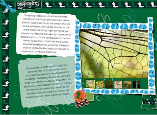
My overall page designs for each section, each chapter is the corresponding pattern and heading with a framed area of facts.
my first section basically defines what migration is and various migrating species and is accompanied by a quiz about general migrations.
i placed a lot of patterned strips behind my quiz simply because the background is black and i felt that is needed splashes of colour to break up the expanse of colour. at first i was worried that it looked a little manic but i think that because of the black background and there isn't any thick areas of pattern save for the boarders that it works visually.
ive tried to manipulate various angles to keep the content more visually striking and maintain a clear balance between text and images, my pages are crowded but i didnt want them to be too crammed, there had to be breathing room which is why ive kept the pattern shapes small and carefully arranged my items so they overlap in the right order.
the arrows that ive placed on the edges of each page swipe to the next page (i books did this automatically anywhere along the edge but i thought the arrows added a bit more personality to the simple swipe action).
out of all of my pages, my hummingbird one is the one that i like the least, its not as interactive as the others, but i ran out ideas, some of the images have pop overs and there is an audio file but it seems a little flat compared to my others. i dont really know how to change this however so i plan on bringing it up in the crit.


No comments:
Post a Comment