Wednesday, 15 May 2013

Ibook Table of Contents


So i combined strips of my patterns to generate an effective cover, i wanted it to mirror my pages but i also wanted it too look like a book cover which is why i added a stitched border and corners to the overall design. placing my heading on a large black strip was to draw the eye straight to the logo and to break up some of the patterns so its not too manic although admittedly there is a lot going on within the cover.

 i had a few issues creating my table of contents because each page used the same constraints on the text which is why some of the headings arent as alined as i'd like them to be. In the image above i added the butterflies to make it relate more to my subjects, although the butterflies are all the same i dont think it matters too much because they are so small. The blue frame around the edge related to my framed facts at the beginning of each chapter.
 i opted to use photographs to give my ibook a bit of relief from all my patterns, as well as this i guessed that the table of contents would display my chapters which use the patterns as backgrounds.


Making Ibooks Continued

My overall page designs for each section, each chapter is the corresponding pattern and heading with a framed area of facts.
my first section basically defines what migration is and various migrating species and is accompanied by a quiz about general migrations.

i placed a lot of patterned strips behind my quiz simply because the background is black and i felt that is needed splashes of colour to break up the expanse of colour. at first i was worried that it looked a little manic but i think that because of the black background and there isn't any thick areas of pattern save for the boarders that it works visually.


ive tried to manipulate various angles to keep the content more visually striking and maintain a clear balance between text and images, my pages are crowded but i didnt want them to be too crammed, there had to be breathing room which is why ive kept the pattern shapes small and carefully arranged my items so they overlap in the right order.


the arrows that ive placed on the edges of each page swipe to the next page (i books did this automatically anywhere along the edge but i thought the arrows added a bit more personality to the simple swipe action).


 altering the opacity of the various text boxes also helps to contrast in colour, its softer than my patterns and it allows my background to come through which initiates a sense of depth. My aim was to create a patchwork effect which i felt was key to my visual style.

 out of all of my pages, my hummingbird one is the one that i like the least, its not as interactive as the others, but i ran out ideas, some of the images have pop overs and there is an audio file but it seems a little flat compared to my others. i dont really know how to change this however so i plan on bringing it up in the crit.

overall im fairly pleased with how my pages and chapters have turned out there is a clear style and im really happy with how well my patterns have integrated, in the pitch my plan was to use my patterns and thats pretty much the only design plan i had so im glad I've managed to build on that and make it work with my content.

Making the Ibook- Using the Widgets

Placing all my elements together i started by using a simple layout since i knew my content was limited i knew that 2 pages per chapter was probably going to suffice, i placed each of my pre-made backgrounds after my main chapter patterns, i did have a few animations ready made, (butterflies flapping) and i initially wanted to place them as a background but i thought they looked too clunky so instead i kept my backgrounds clear and started by inputting my text, once my text was placed i then incorporated by images since my design revolves around them. 


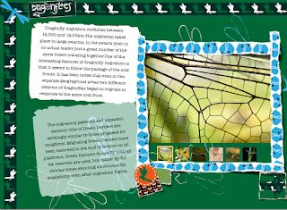
i used image galleries on my monarch butterfly page and my Green darner but in order to illicit change i opted to place my hummingbird gallery in a scroll bar, i didn't think this was obvious enough though so i added a torn label up the top in order to draw attention to it. after which i framed the entire gallery with a segment of pattern with torn edges (the gallery didn't have an edge options) and it was the only way to soften the edges and make it work with my page. adding my illustrator made flowers at the bottom of the page also enabled me to introduce a pop over. 


i presented my text on boxes that i created in illustrator- i used two sets, one tan and one white (i used a specific art brush on the edges and thought that it would relate to and simultaneously contrast with the torn edges picture frames used on the i books author) and placed them behind my text which was written in my chosen typewriter font. i then edges the boxes with various squares and circles of 'stitched' pattern some of which used pop-overs.


this was the slide puzzle widget that i took from Bookry the image is its placeholder which is why ive labelled it to make sure that this was clear. once again a large section of pattern generates a base for the widget and breaks up the expanse of fill green background.

 i have two videos in my ibook and one audio both videos were presented with transparent fills and torn edges frames, each video has the option to become full screen and i particularly like the dot boarders to the title which frames the text without appearing too overwhelming.

the audio is a tiny circle with headphones, it barely takes up any space but in order to make the audio clear i opted to once again use a pattern to contain the element, the caption i placed next to it, jaunty angles to create the messy patchwork style.

i initially wanted to place my butterfly animation behind all of my elements but that proved too difficult since Ibooks author over rode the transparency settings on the mov file when dragged into the ibook, which gave my animation a black background that i didnt like. because of this i opted instead to place my animation on top of a patterned background and import it is so i became one of my many background patterned squares that lined the text and images.
 i mostly used the interactive image widget to incorporate some fun facts that i didnt think would read well within a paragraph, i only really used this widget once since i was trying to display a range of interactive elements.
i was a little worried that i had used the torn edges option too much but i think it works well visually so i plan to bring it up in crit and see if any of my peers have an opinion on the matter.

Ibooks continued 4....

i briefly found some other ibooks that used some of the widgets available on ibooks author although i had a vague sense of visual style i wanted to see how other i books used some of the widgets so i could integrate them into my own without being too clunky and forced. I want to ensure the overall fluidity of my ibook and make sure that is is both visually appealing and simultaneously engaging.

 The sliding puzzle widget is one that can be found on the Bookry site and also one that i plan on using, its fun, simple and doesn't rely on text so it would be best used within areas that are text heavy.
The widget above adds labels and zooms into the image where the points are placed i could use this to add small portions of text that aren't coherent, or important enough to place within my paragraphs, although using htis widget requires a high quality image.


 this is an example of the image gallery and how it can be expanded to full screen, i think ibooks does this automatically but it is once again reliant on high quality images.

the pop over as seen in the image above doesnt actually have to have a solid tap point, a transparent shape could be placed over an image, however i plan on using my pattern segments to do this which can be placed around my text and images.


having seen some of the other interactive elements used within other ibooks, i now have more of an idea as to how to incorporate the interactive elements, although the ibook examples above are text heavy and formal i plan on trying to give the widgets themselves some more of my own style to ensure the overall continuity.

Ibook continued 3....


i wanted to experiment with how im going to display some of my images, as well as an image gallery i plan on also making smaller thumbnail images that frame some of my text content. i plan on using the torn edges frame to continue my handmade/stitched style.

 using popovers on some of my images makes my ibook more interactive and adds an element of fun. I haven't really marked the image as interactive but i have placed a butterfly button on top as an indicator something that i could continue on my other pages.
 i also want to include some popovers that don't contain any text and are image based again using a torn edges frame to ensure the overall continuity.
using my patterns i plan on overlapping them within large gaps, possibly adding pop overs or other interactive elements to give them more of a purpose than simply filling up large areas of blanc space. adding dashed borders gives them a stitched feel and also matches my headings.

Ibooks continued 2....

Before fully beginning my ibook i did manage to find a couple of screen shots that gave me a flavour of  what an ibook could look like,
this one entitled road trip was the one that i liked best. i liked the jaunty angles and the frames which really corroborated with the pin board background, interactive elements could be added incredibly easily to each of the images, pop overs and scrolls would initiate some interactivity. mostly i just really liked how image based it is and how relaxed the overall style is so i plan on using the stitched style that i have throughout my logo designs and somehow combining that with some of my patterns to generate something bright and fun.

Here are some of the backgrounds ive generated specifically for the ibook since i felt that hints of pattern would work better on top since it would be less overwhelming  than using my patterns themselves as backgrounds Although i do plan on using the patterns on my main chapter title pages.
  i used the orange from my colour palette, incorporated strips of pattern as borders and since this was intended for my monarch butterfly section i added blue butterfly outlines in a rough brush to add point of interest it also simultaneously directs the eye to the top corner.
i did the same to the rest of my backgrounds, alternating the patterns and colours depending on my subject matter and made sure i created the same backdrop with the borders on the opposite side so my pages would flow together. 


The black backdrop i intend to use as my explaining migration page which is why I've included all of the species that i have looked at. 

ideally i would use a pattern based background for my chapter headings as shown above. and the less overwhelming backgrounds as my pages which would flow across the ibook and match up when swiped across. since i dont have a great deal of content (because i want to keep my website relatively straightforward) i plan on cramming my information together so my page looks interesting and engages my target audience. 

I Books Research Continued...

i found it hard to research the i books since i dont have an iPad and most of the free sample books are literally just books without any interaction, so i decided that i would download i books author and explore the interactive elements that can be used with the software.


These are some of the widgets available in i books author and i defiantly plan on using most of them, since my designs are incredibly pattern based i feel that a rougher, scrapbook mismatched style is whats going to work best with my designs. so i was pleased when i found in the inspector that pictures could be given various frames that could highlight my theme. 
\
i even initially played around with the image gallery feature since i knew that they were going to be key aspects in my ibook. i wanted to ensure the visuality and make sure that my overall content wasn't too heavy and text orientated. i also wanted to ensure that my design maintained a fun, messy presence which i think not only concurs with my visual style but it also makes the ibook more user friendly and more engaging for my level 3 target audience.
A quick experimentation with how i could make my image galleries look, altering the frame to the torn edges option which softens and and simultaneously separated from the simple orange fill placed behind it.
i also looked into some Bookry widgets which contain some potential interactive elements. although some of them are a little too formal or contrastingly somewhat childish (and not in a way that i could integrate them in well)- the sketchpad being one example. However some of the widgets, the youtube one for instance, the i tunes music and even the slider puzzle all look interesting enough for me to include within my ibook.


So after my brief experimentation with the Ibooks software i feel that it would be more prudent to simply experiment with the tools to create my own visual style, most of the interactive elements are fairly easy to navigate and i think its more about the design and aesthetics so i don't have to worry too much about technological structure as i do with  the website. i actually have a lot of the content already made on illustrator although i may need to think about creating some blander backgrounds specifically for the ibook.