Sunday, 24 November 2013

Geometric Wallpaper...

I looked into geometric 70's wallpaper so I could really establish a bright retro theme that worked well with my Glastonbury festival theme.
Theres lots of repeats, simple shapes and vibrant colours.
There are lots of oranges evident within a lot of these patterns something that I should consider when introducing them into my work.
Im not even sure what I'm going to do with the patterns, I just wanted to really emphasise my theme and the festival era that I'm using.

Wednesday, 20 November 2013

Roy Lichtenstein

Roy Lichtenstein also created pop art although I think is styling may be more translatable to my app design particularly since he has a body of work featuring fruits an essential element within my ideas.


I was surprised to find that U2 had used a Roy Lichtenstein painting and animated it for one of their shows, I love how it matches the beat of the music and it matches perfectly to the tone of the song which has a distinctive bass that dictates the overall pacing of the animation. Its fast paced fun and I really love the style which is consists of simple block colours, bold outlines and the occasional polka dot section. Which has been used to transition from once scene to the next. I really like the explosion section which allows the colours to dominate the frame.


 I generally tried to look into more of his work that featured fruit so I could get more of an idea to style my game although it was by happy coincidence that the two prints above use the same colour scheme as the Brothers brand. I think that simplicity is the key, so I plan on using flat shapes in general which are only going to be punctuated by small elements of detailing - like the use of dots or lines. Mostly I just love the geometric styling thats evident and I really want to explore that angle.


 The above print is probably one of my favourites I just really like the boldness of it - it reminds me a lot of the bauhaus movement just through its use of bold black outlines and segments of solid colour. I think I'd like to make my apples have that element, half dotted half solid.

http://www.phillips.com/detail/ROY-LICHTENSTEIN/NY010110/137?fromSearch=lichtenstein&searchPage=1


Tuesday, 19 November 2013

Pixel and Resolution Sizes


Its important before designing that I know the pixel and sizing of what I am designing for although of course I wont be making the app it'll be good to know the canvas size that I should be working at. I only got the specs for the latest iphone/pad since we aren't making it I don't have to worry too much about other sizes.

The iPhone 5 specs: 1136 by 640 with a 326 ppi resolution

The iPad Air- 2048 by 1536 with a 264 ppi resolution

http://www.apple.com/uk/iphone-5s/specs/
http://www.apple.com/uk/ipad-air/specs/

Pop Art- Andy Warhol...

I was inspired by the I-tunes advert to look into pop art which of course instantly led me to Andy Warhol, the blocks of colour used look brilliant and the flat simplicity of the style could be translated easily into my app.

The Monroe screenprints are probably the most famous out of his work, I love the colours used, how blocks of colour dominate the background and only hints of texture are introduced through the shading, it definitely has a hippie feel which would match the Glastonbury roots of my brand and would be iconic enough perhaps to ensure interest.


Andy Warhols flowers are incredibly simple (simplicity is the key to my app so I want to try and keep the app style simple too). The bright solid flowers contrast with the grass background texture - Perhaps I could mimic this using fruit? 


I like the repetition evident within the Campbells soup screenprint, its something that I would definitely like to mimic since I think its a really fun way to convey something quickly- I could fill the promo with repeats of the different fruit. Or all the different bottles perhaps!


Thoughts so far...

Because Glastonbury has 70's roots I think incorporating this within my app will really separate it visually from the other festival cider brands already research. The Brothers label has a carnivalesque style to it so I don't think it would be too out there. As well as this theres a strong musical element because of Glastonbury anyway and I'm toying between using T-rex or some other kind of upbeat hippish band to make my trailer to. Of course I will have to make sure that the Brothers branding isn't lost within the idea but I think if I use certain colours that it could work.

I plan on looking into:

Pop Art- the Itunes advert reminded me a lot of pop art with its squares of colour and I think I could use this within my work.

Exploding fruit- Its a huge aspect within a lot of the adverts including Brothers's own and I think it could be translated into a game.

Brothers Brand- Glastonbury

Since Brothers is a festival cider, advertises itself as a festival cider and has a heritage linked to Glastonbury (the current Brothers made a name for themselves selling their pear festival cider at Glastonbury in 1995). I decided to investigate Glastonbury in hopes that I could create a visual style revolving around this festival.

Initial thoughts about Glastonbury
Hippies
Music
Glamrock
Farm
Tents
Pyramid Stage
Flags
Rain
Party

Glastonbury began in 1970 the day after Jimmy Hendrix died and continues to this day. It really began with a hippie influence (their are peace signs next to the stage) which is somewhat in play today. The very first line up consisted of nine artists:
Al Stewart, T-Rex, Quintessence, Amazing Blondel, Stackridge, Steamhammer, Keith Christmas, Ian A Anderson and Sam Apple Pie.

In 1978 the festival was not on but 500 people still came to attend, an impromptu festival was organised and those performing went onto a stage being powered by a caravan.

In 1994- The Pyramid Stage burnt down, and a wind turbine appeared beside the main stage.

In 1995- The Year the Brothers sold their pear cider and Glastonbury's 25th anniversary the Dance Tent was introduced. Acts Included, Massive Attack, The Cure, PJ Harvey, Portishead and Oasis.

Some Glastonbury promotional posters:

 I love the hippie element to this poster above, the psychedelic colours and curves all allude to a relaxed peace and love festival.

 I think the pyramid stage poster is one of my favourites, i really like how the pattern has been used within the background and the little peace sign that occupies the corner of the stage.
 The type above mimics that of the Glastonbury sign- much like the Hollywood sign the Glastonbury sign is situated on a small hill within the festival although its far brighter and more textural. I am considering using a similar font style to make my play and menu buttons since I think its very iconic to glastonbury.

http://www.capricorn1.co.uk/images/products/Glastonbury_1.jpg
http://www.glastonburyfestivals.co.uk/history/1981/
https://www.google.co.uk/search?q=glastonbury+posters&espv=210&es_sm=91&source=lnms&tbm=isch&sa=X&ei=qo-LUveyGsfAhAeYuYGwDw&ved=0CAkQ_AUoAQ&biw=1259&bih=847#es_sm=91&espv=210&q=glastonbury%20posters&tbm=isch&imgdii=_
http://www.songkick.com/festivals/585-glastonbury/id/710796-glastonbury-festival-1970

iPhone Usability and Gestures...

The usability and gestures for the iPhone are much the same as the iPad but I've found another article which really highlights the interface and usability which I'm going to similarly quote from and add insights below.
The interface

"Grids of apps fill as many pages as needed, with each new page stacking to the right of the home one. Swipe left and you’ve got the quick search facility for looking up apps, contacts, emails and much more besides." 

"Tap the home button and it’ll close the app you’re in and take you back to the homescreen. Double tap and you can see all the apps you’ve got running.Swipe down from the top edge of the screen and you’ve got a notifications tray that shows the weather at the top (tap to see more detail), stocks at the bottom, and all the various notifications about new emails, messages on Twitter or upcoming appointments in between."

http://www.trustedreviews.com/apple-iphone-5_Mobile-Phone_review_ios-6-interface-and-usability_Page-3 

Overall the interface is much like the iPad only smaller and because of the size apps and screens are little more condensed. Keeping it simple keeps the overall usability simple. The Gestures are much the same as the iPad although they accommodate for the smaller screen.

Gestures

Swipe,- a left to right finger swipe
Drag,-holding and dragging
Scroll - down swipe movement
Flick- fast downward swipe flicks pages down
Tap- select
Pinch- zoom in and out

https://discussions.apple.com/thread/2747299


Usability iPad- Gestures/Movements etc...

As it was highlighted in the brief I did a small amount of research into usability and gestures although because I'm familiar with apple software most of it seems fairly straightforward. I also commented on gestures and usability throughout my app research.

I found this article which really explains the usability and how to use elements for the iPad very simply so I'm going to quote from it below and offer any insights afterwards.
Usability

"Most navigation on the iPad is done with simple touch gestures, such as touching an icon to launch the application or swiping your finger left or right across the screen to move from one screen of icons to the next. These same gestures can do different things based on the application your are in"

"In addition to tapping the screen and moving your finger across the screen, you will occasionally need to touch the screen and hold your finger down. For example, when you touch your finger against an application icon and keep your finger held down, you will enter a mode that allows you to move the icon to a different part of the screen."

"Apple's design is to have as few buttons as possible for better usability on the exterior of the iPad as possible, and one of the few buttons on the outside is the Home Button."

The Home Button is used to wake the iPad when it is sleeping. It is also used to exit out of applications, and if you have put the iPad into a special mode (such as the mode that allows you to move application icons), the home button is used to exit that mode."

http://ipad.about.com/od/iPad_Guide/ss/iPad-101-New-Users-Guide-Install-Move-Delete-Folders.htm


Gestures

 I looked into gestures for the iPad although they are much the same as the iPhone

Swipe,- a left to right finger swipe
Drag,-holding and dragging
Scroll - down swipe movement
Flick- fast downward swipe flicks pages down
Tap- select
Pinch- zoom in and out


Because of the bigger screen there is also a mulit-touch element with a 5 finger pinch motion being incorporated into the gestures.

Overall the iPad and its app's occupy the realm of simplicity which I think is what makes it so easy to use. This should be mimicked in my own app design and I should accommodate for the simple buttons and navigation style when designing.

Trailers/Promo's With Strong Musical Influence...

Music was an aspect highlighted in our brief and although a lot of the promo's I looked into had a musical presence I wanted to look into trailers (animated trailers in particular since this is what we have to create) that really highlighted the music. As well as this I wanted to look out how other brands have visually portrayed their brands within adverts.


I actually really love the I-tunes advert because its so simple but its got a great style, the bright blocks of colour that change with each silhouette really helps to indicate the wide audience. But mostly I love the vibrancy and I definitely want to experiment with blocks of colour particularly since my brand manipulates bold blue and yellows. The integration of the beat within the dance moves and the cuts works really well and I like how sometimes the words are being mimed by the variety of characters. One of my favourite trailers so far especially since its very fast paced as well. Again its clean clear and devoid of any texture which matches the apple brand.


The new John Lewis Christmas advert was one that I've seen on TV recently (although of course the subject matter relates in no way to my own) and theres a clear musical influence which I think really makes the trailer. Whilst I find the whole styling of the trailer incredibly sweet and I love the two characters and the overall message, I think its Lily Allen's saccharine vocals that really helps to embed the tone and message to the trailer. The lighter segment of the music times perfectly to the happier ending and theres a clear sense of friendship thats conveyed through the music. What starts as a fairly melancholy song appropriately lightens which is visually displayed through the animation. The animation itself is gorgeous, the 2D characters are perfectly balanced between realism and flat cartoon and contrast against the small sections of reality- the 3D present and the more realistic trees and background setting. The lighting is also impeccable which introduces some lovely shadows, a golden glow and easy transitions between the seasons. The text element is also really lovely - small sentences at the beginning and the end that help to round of the story and give it a story book theme.


The Factory Coca Cola advert is actually really impressive and I like how the fantastical element is introduced through this little factory world. The music matches that styling implicitly and I like how sound effects have been used to generate a realism. Theres a good sense of pacing to the trailer which is exemplified by the music. The branding is evident through the label and at the end of the trailer.

Alcohol Adverts...

I've looked into app trailers but I wasnt too impressed with the ones that I found so I decided to look into trailers promoting the alcohol itself since I think they'd me more visually interesting elements that could be looked into.

I began by looking at a trailer for my chosen brand: Brothers.


The trailer starts by focusing on the fruit which then explodes  in a myriad of colour (an aspect that I liked from the Strongbow cider posters and really want to include within my game design). Before then using the festival aspect of its heritage to display the actual bottles of cider. There is a great deal of movement and although people are used within the second half its a generic party atmosphere which I think helps to really clarify Brothers' market, festival goers ages 18-25. This is something I want to focus on because I think it would make for some fantastic visuals. Although the second half of the trailer is quite dark the vivid bottle colours and fruit colouring really initiate contrast. The end of the trailer display close ups of the bottle and brand which also really elucidates the Brothers brand something I may consider within my own trailer although of course I would have to end on a picture of the Brothers app or something of that nature.


Since I loved the Strongbow posters, I decided to look into the trailer for the Strongbow pear cider. Its a great trailer in terms of musicality. The music (extreme music win or die) matches the movements perfectly climaxing when the fruit explodes an element visually displayed in the poster. The barren landscape also creates drama and the silhouetted man is broke up only by the green eyes which match the colouring of the pear. Long wide angles shots create scope and there really is a great sense of theatricality which is also highlighted and perhaps established through the dramatic instrumental music. I like how the bottle and brand which is shown at the end of the trailer is linked to the bow and arrow figure by two green arrows that land within frame which gives it continuity.


I also looked at the Bulmers trailer because from what I've seen they've got some really fun branding. Unlike the others this trailer has more of a storyline and focuses on three individuals. Once again Bulmers is being branded at younger people 20-26 in this advert and the advert begins with the three individuals partying (cider seems to be branded for party goers perhaps because of age). I like the sense of movement and the reverse nature of the trailer which makes the actions being depicted more interesting.  I also like the part where the colourful clouds of dust are introduced which I think works really well visually. Although I cant say I really liked the music it did work well with what was going on onscreen and initiated a jazzy upbeat feel which matches the party goers branding. The Bulmers brand is further solidified at the end of the trailer which cements the cider in the audiences mind.

Cider Advertising Posters...

I wanted to look into how different ciders had been advertised as well, I've already looked at the Brothers poster advertisements, so I decided to look into different posters that other ciders had created to advertise their ciders.
This Bulmers advertisement is from1953 and I mostly looked at because I wanted to see how heritage could be included within the advertising. The poster lacks colour and and has a hand-drawn real life drawing element to it which I guess is because of the era. Theres a strong text element as well and although I wouldn't say the slogan or the imagery is particularly catchy at all its informative all the same. It contrasts a great deal with the new Bulmers poster below which is super bright and fun. I love the humour thats been introduced through the parachutes which makes the cider seem more fun because of it. Once again its clear that Bulmers has been aimed at a younger audience because of its vibrancy but its really effective because of it. The natural colour schemes helps to establish he more natural quality of the drink and even though the parachutes are what drew me into the poster the larger than life bottle really cements Bulmers branding and becomes the main focal point of the poster. The text is also really effective and I like how swirly and bold fonts have been blended together to create the overall style although I much prefer the swirly font to the block caps of the limited addition. Theres also a sense of pattern highlighted in the grass something that I plan on using within my own app and promo and I like how realism has been introduced into this fantastical scene through the use of light and shade.

http://www.thedrum.com/uploads/news/old/13871/master.Bulmers_SBMaster6ShtAW_FINAL.jpg

The Merrydown cider poster is very simple, it manipulates contrast through the green and red colour scheme, the background is a simple gradient which offsets the slightly darker tone of the bottle and matches the yellow gold of the front label. The large cap type is eye-catching and easily read and what would have been too clunky as been given a delicacy through the crackled stamp effect. Having said this I feel the poster would be boring without the chunk of apple thats been torn out of the bottle which gives it a sense of humour. I like how this has been used to convey the flavour and its been seamlessly generated. Once again as shadow has been introduced and the realism of the bottle grounds the poster within reality.
http://grocerytrader.co.uk/?p=3002


The Strongbow cider advert above is  by far the darkest advertisement that I've looked at which gives the advert a very dramatic feel. A sense of fantastical has been introduced through the thorny vines which obviously relates  to the flavour "dark fruit" and although the brand is central within frame and light enough to ensure that its the main focal point the denseness of the background really helps to introduce contrasting texture. The only light points are the Strongbow text and the 'Earn it' slogan which are made more apparent through the use of lighter colour. Despite this text isn't the main element and I like the importance of the background photograph it helps to almost give the drink its own personality that still concurs with the brand.

https://blogger.googleusercontent.com/img/b/R29vZ2xl/AVvXsEhyW5vJTfERlfby0kxvY9FzRs9qD8HwSOkdHraKSZXy8LLAQjfTWIBt_Mhl-Sm2RA83h_aV3n7DnZaUUjBBiuW1aF1BVA6HelE8EmMatGRDmALGXHeEpaxzUR7MaXaSeD3wzoTjX7vJFjE/s320/Screen+shot+2013-08-22+at+12.42.39.png


I liked the movement evident within these posters, once again the dark background is dramatic but the plainness of it mostly helps to off set the movement which as been captured. I really really like this use of high speed photography because I think it makes beautiful shapes with the juice. The arrow simultaneously visually represents the Strongbow logo which really elucidates the branding in a more clever way than just the logo itself. The golden apple in the top has a more fantastical element to it due to the bright colour and the liquid gold drops but I really like how the text has been placed centrally and within the image rather than just at the side like in the poster below.

http://www.wearebulletproof.com/wp-content/uploads/2011/09/STRONGBOW-GOLD_04.jpg

Trailers/Promo's for Alcohol Apps...

After looking into some alcohol apps it made sense to look at how they were advertised. Since I'd looked into the general app store advertisement I wanted to see how an app with its specific brand and purpose was advertised.


The Stella Artois 9 step pouring ritual app uses a voice over to explain the game, with each level of the game being displayed accompanied by the various movements needed to complete the level. Theres a range of movements which I think keeps the game interesting although the trailer is informative I think it should be able to be seen in its own right and be enticing without having to visually display the steps of the game. The trailer ends by using kinetic text which displays the Stella Artois website which helps its branding. They have definitely designed the app specifically for the iPhone which is highlighted through the various movements as well as the clean white background and hand tap element that mimics that of the app store trailer already researched.


The Trailer above is for the Absolut cocktail app, the app itself isn't very memorable at all but initially the trailer actually avoided the phone as an outline and tap the various elements as the previous promos have. It began by having the glasses appear in long lines and fading out to square icons that are elements within the app. I actually think it would work better if the app avoided the classic phone tap for a while because I think it would be more interesting and allow for a smoother movement. Something I plan on using within my own 15 second promo - I also think that because I have a shorter amount of time for mine it would be faster to avoid the phone tap portrayal.

Apple App Promo Trailer General...

 I wanted to see how apps in general have been promoted and found the following trailer that
promotes the app store.


The use of voice over explains the process without which the trailer wouldn't make much sense. The stark white background contrasts against the black of the phone which obviously keeps the phone as the main focal points, the hand helps to convey the tap movement which keeps the trailer running smoothly.  A few apps are advertised on the phone to show the extent of how useful they are and each seems to vaguely relate because the transitions between each is smooth, I particularly liked how a coffee app then linked to buying your coffee through your phone and scanning it which actually broke up the standard tap, display app structure that dominates the trailer. It matches the Apple brand because its sophisticated and sleek in style but I don't think its very fun at all although the 'If you don't own and iPhone' has a satirical element to it not a lot actually happens in the trailer, perhaps because its a general advert for the app store rather than a specific app.

App Game Research...


Since I've been swaying towards making my app include a game I opted to look into the big app games that are highly successful and aimed at a broad audience.

Angry birds is perhaps the most well known, Using swipe motions and a sling shot you have to drag the sling shot back and release to fire the birds at the pigs. The less birds you use and the more pigs you knock of the more points you get. The games itself centres around the two sets of characters birds and pigs which I think helps to maintain the necessary simplicity.The cartoon style used is bright and effective and theres a clear sense of background and foreground which ensures that the focus of the game remains on the characters. The backgrounds are simple but detailed enough to generate this world and provide additional detail. The world is full of flat shapes and colours- there aren't any additional textures to interfere with the game itself. This once again keeps the visuality simplistic and fairly generic so it appeals to a large audience. The interface of the app is also relatively simple with one button that brings a sidebar menu into view, this menu has a back button, a redo button and a main menu button. This allows there to be navigation without interfering with the app dynamics and visuality and I plan on considering this for my own design.


Fruit Ninja is another very popular game- swiping as many fruits as possible before the timer runs out in as many combinations as you can, you also have special bananas that release certain useful tricks when hit and bombs that must be avoided. The ninja game also uses a sole swipe movement which keeps the game simple.  The colours are  bright and text is used to let you know when you've achieved a target and I really like how the blurred lines of colour visually display your movement. Once again the fruit is simply shaded and theres no additional fuss in the styling which keeps the focus on the game. The timed aspect helps to give the game more of a goal and I particularly like how background patterns are introduced to clarify certain achievements and targets as well. Again the interface and navigation is simple and their are 4 different types of games that can be played which is signified through the use of different fruits as icons. When playing the game, like Angry Birds, theres also one button that you have to hit to release a top bar navigation panel containing a back redo and main menu button.


This cupcake game isn't really popular but I liked how recipes have been made into a game. Once again it manipulates simple movements you have to drag the ingredients into the mixing bowl and swirl to mix them together, tapping the milk releases drops which fall into the bowl and then you can decorate by shaking the app and releasing the sprinkles. For something so simple its very effective and I like the way that it makes you use different motions. I also like how each stage is emphasised by the different motions. The interface needs work since as far as I can tell you have to finish the game before you can navigate back to the main menu. Im not a huge fan of the styling either but it matches the home baking content. 

I am a lot more certain now that a game is the avenue I want to go down. It'll fill the entertainment aspect of the brief and allow me to integrate more movement. I was initially worried about making my app landscape on both Ipad and Iphone but since both Angry Birds and Fruit Ninja manipulate a landscape positioning I'm not as worried although its dependent on my background I think a landscape positioning will work better because it will allow me to incorporate wider movements. 


Monday, 18 November 2013

Apps Designed to be Informative- Recipes....

Since I've looked up apps that revolve around alcohol, I wanted to find some examples of how apps could be used as an informative design. The brief stipulates that our apps should be useful, informative and or entertaining so it felt prudent to see how apps have been designed specifically to inform.


Jamie Oliver's recipe app was one of the first that I looked at that displayed various recipes. Theres a great deal of rustic appeal to the app which I think corresponds with his target audience (mums, and middle aged women). I actually really like the simplicity of the app theres a certain homegrown element to the design which is further solidified by the recipes themselves. The textural wood backdrop that is evident throughout most of the pages is bland enough not to detract from the overall branding but it also provokes a contrast to the photographs. Using photographs as buttons really visualises the different sections and although theres a very rural element there is also a smoothness to the design evidenced by the interface itself. Again icons remain firmly in the bottom of the frame but because this app is only for Ipad the list is more extensive and there is also a tab element to the navigation at the top of frame. The tabs match perfectly stylistically as they integrate a paper like texture as well as signposting the various elements evident within each recipe. Perhaps I should consider using tabs within my Ipad app- although since at the moment I'm heading more towards the game element I'm not entirely sure this is going to be useful.


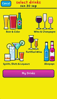
The Change 4 life drinks tracker is displayed very informally due to their broad target audience. Simple cartoons and bright colours dominate the app and completely mimic their logo. There is far more of a playful element thats not evident within a lot of the other apps that I've looked at.  Once again the navigation has been visualised using imagery and i like how easy it is to navigate because of it. The apps purpose is to calculate the units that you've been drinking in a bid to generate a healthier lifestyle. It gives you the types of drinks that you may drink and then gives you a rough estimate of the units and how many you can have and still maintain a healthy diet. It also keeps a track of your units throughout the week. Considering this apps healthy serious content matter the design is fun, vibrant and optimistic which actually helps to retain audiences attention and interest.


The app above has been created to inform the audience about the upcoming cider festivals and the variety of drinks that are available at them, theres also a map element and a directional element. The app is made for iPhone so the app is portrait and once again manipulates a 5 icon navigation bar at the bottom of frame. The styling isn't interesting at all, the brown colour scheme is bland and boring but I think its mostly because the app focuses on the information rather than the visuality.

Overall I'm definitely developing an idea of the overall app interface and I'm beginning to get a feel for the more attractive visual styles. I plan on researching app games since I think that this is going to be my focal point within my app to see how the interfaces look on those and whether they vary much from the standard.

Apps Designed for Alcohol...

I began my app research by looking into apps that were designed around alcohol and alcohol brands, since our project revolves around alcohol branding it made sense to make this my starting point. I wanted to get a general idea of what apps were out there and what could be done within them.

The first app that I found was a cocktail one, it was mainly informative, but it also had a game section. The styling of the app is seemingly sophisticated suggested through the clean colour palette and the simple shapes. The app allows you to look into cocktails based off your favourite drinks that you input. It also has a small recipe section in which theres is a game element, where you have to mix the cocktail together out of the given ingredients. Whilst this visually represents the ingredients it is very simple and and feels too fun to match the rest of the app. Patches of colour help to define the different types of cocktail and initiate a vivid element in an app that is primarily black and white. The interface is simple, with the various page icons occupying the bottom of the frame, whilst the logo remains cemented top centre throughout most of the pages, although sometimes it varies in size. Because there isn't a specific brand displayed the app feels too impersonal the styling comes across too plain to convey any sense of fun or interest.


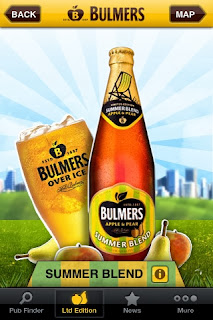
The Bulmers app was one of my favourites, its bright fun and it definitely emulates the Bulmers brand. The yellow backgrounds initiates a vibrancy that also correlates to the original flavour. Although the solid background is only used on the end page and in one of the photogames. The app itself consists of a cider finder and a picture game where you can force pictures into a Bulmers bottle shape. There was also a prize up for grabs for the best bottle photograph. This photograph could then be tagged. I don't really like the game since it seems pointless despite the prize incentive but I do really like the styling of the app. The homepage is one of my favourites and I really like the background sky stripes and the white edges around the shapes, its reminds me a bit of pop art just through its colour use and outline. The white outline helps to separate the brand from the background and gives it a younger feel (Bulmers is aimed at 20s-35s) and this is distinctly conveyed. There is also a sense of the country and a sense of nature which is fully suggested by the vines, clouds and greenery that are present within certain pages. Again the interface is simple the middle section of frame consists solely of the brand itself, with the other page icons situated at the bottom of frame. This is continued throughout although a top bar with a back page and a direct link to the home page has been added for easy navigation.


The Stella Artois 9 step app is actually a really fun game that is simultaneously informative, it visually displays the steps in pouring the perfect stella. Rinsing the glass, Pouring the beer at the perfect angle, cutting off the foam, swirling the beer are all stages within the game. Although the styling is very muted it does match the branding of the beer and the graphics themselves look like a simple smooth cartoon which also coincides with the brand. Simple motions, swipes, shakes and taps dominate the entire game  which I think makes the app more fun because its easy to do on all platforms (something that I have to consider because i'm designing for both Ipad and Iphone.) The interface is equally simple it has a next and a back to home button which situate at the top of the frame.  There's also sound effects which help to distinguish the variation of movements and an instruction setting that allows you to go through the game step by step.

All of the Apps I've looked at so far have been portrait setting on both the Iphone and Ipad.

Thursday, 14 November 2013

Alcohol Advertising Laws

Before looking into Apps and promo's I wanted first to clarify the laws revolving around alcohol and alcohol advertising.  
I have found that alcohol adverts must not:
Be directed at people under the age of 18, or contain anything that could appeal to them (reflecting youth culture).
Link the consumption of alcohol to irresponsible behaviour, success or attractiveness.
The placement of these adverts within Radio and TV must be considered carefully, Alcohol adverts are banned from appearing around programmes created for those under 18. 
I couldnt find any laws that specifically related to apps but I'm assuming that there are going to be the same as those that directly effect the TV. An app cannot be marketed or sold to anyone under the legal age (all of which seems fairly obvious anyway. Drinks companies are legally required to target 18's and overs as well). I've decided to design an App promoting the Brothers brand whose target market is 18 and above so I will have to be careful with my design that I don't accidentally market to a younger age group. It shouldn't be too much of a problem since i plan to try and keep my design fairly generic so it relates to a wider audience.
http://www.asa.org.uk/News-resources/Hot-Topics/Alcohol.aspx

Brothers Brand...

History
Brothers have been making cider since 1658.
In 1842 Brothers opened their first pub named The Kings Arms in Shepton Mallet.
During the Second World War the supply of cider was in great demand and they continued to produce cider throughout.
In the late 1940's Brothers came up with a drink called Babycham (sparkling perry) 
In 1995 at the Glastonbury festival the Showering brothers sold what is now well known Pear Festival Cider. 

Brothers comes in a variety of flavours: Toffee Apple, Strawberry, Wild fruits, Pear Festival, Pear, Apple and Cloudy Lemon. 

The Brothers website has a cider locater of its own show above, as well as a flavour mixer (below). Because  they already seem to have their own locater I think I'm definitely going to rule out using this for an app- that and personally I think locaters are only useful if your looking for a more obscure brand something I don't think my cider falls into.


This is one of their poster advertisements which I looked at to really get a feel for the brand, the font is bold seriffed and capped, it fills the frame contrasts against the blue of the background and instantly gets the message across. The labelling and the advert itself is one of the older brands since it lacks the swirly carnival concoction of fonts that Ive noticed in the new branding labels which I much prefer.
Despite this the phrasing of the slogan coupled with this simple bold font does grab the attention does imply that it is being aimed at a younger audience. 


Brothers is also clearly linked to Glastonbury, the festival is even mentioned in the add above. I also prefer the long fluid lines in the aforementioned poster it gives the rigid block font a sense of rebelliousness that clearly relates to Glastonbury. The landscape format works better in the poster since it allows the words to breathe within the advertisement and again the blue and yellow colour scheme really helps to elucidate their brand. There is a sense that Brothers is for free spirits which I would definitely like to include within my own design.
Both of the posters are incredibly text heavy something that I guess allows them to maintain a broader audience since people, places and objects have been avoided.

Now I've gotten to know the brand a bit better I certainly plan to include the festival element since its apparent that festivals is a part of its market. I also think that using this festival element may also allow me to incorporate a sense of era - my initial thoughts regarding Glastonbury is a hippie free spirit allotment of people and when I think of hippy's all I can think of is the 70's. I'm hoping that I can include this 70's element since I think it would allow me to experiment with a broader colour scheme and a more interesting visual style that doesn't revolve around type like the advertisements above.